Ape Forge
  • Expedition
  • Journey
  • What We Do
    • Branding & Graphic Design
    • Websites & eCommerce
    • Apps Design & Development
    • Photo & Video Capture
    • Digital Marketing
    • Guidance & Consultation
  • Our Work
  • Pricing
  • Final Draft
  • Events
    • Creative After Five
  • Contact Us

Portfolio

Section divider type: triangleAsym -- position: bottom
Access Octomono Masonry Settings

Western Tile

5/22/2025

0 Comments

 
Western Tile
Western Tile came to Ape Forge looking for a refreshed identity that matched the quality and reliability of their flooring services. As a licensed and insured business providing both materials and labor for residential and commercial properties, Western Tile needed a professional visual presence that would convey trust, craftsmanship, and a modern edge. Our team delivered a complete brand solution—starting with a custom logo and finishing with a new, responsive website.

The Creative Process:
​Crafting the Logo

Discovery & Direction
Before we ever opened our design tools, we started with a deep dive into the Western Tile brand. We met with the client to understand their business, target audience, and long-term goals. Through those conversations, it became clear that their brand needed to reflect:

  • Professionalism: They’re seasoned contractors, not weekend warriors.
  • Durability: Their work is built to last, and so should their branding.
  • Regional identity: The name “Western Tile” evokes a sense of place, and we wanted to honor that.

We explored competitor logos and gathered visual references to see what resonated in their market—and more importantly, what felt overused or stale. This phase helped us identify opportunities to differentiate their brand.
Western Tile Logo Design by Ape Forge
Logo Concept Development
Our design direction began with the idea of grounding the brand in strength and simplicity. The challenge: create a visual identity that felt rugged and established, while still being clean and modern enough to work across digital and print mediums.

We explored three main directions:

  1. Geometric tile patterns – Representing precision and craft.
  2. Initial-based monograms – Bold, minimal, and timeless.
  3. Western-style motifs – Nods to the regional name without going full “cowboy.”

The final logo evolved from a hybrid of the first two: a stylized “W” with tile-like symmetry, constructed to look solid and grounded. The shape subtly mirrors interlocking tile edges, reinforcing the craft and precision of the work Western Tile delivers.

Color Palette Selection
Color was a critical part of defining the Western Tile brand. We focused on a palette that would convey both trust and durability, without veering into overly corporate or sterile territory.

  • Primary color: Slate blue: Chosen for its association with strength, reliability, and professionalism.
  • Accent color: Soft clay tan: A nod to natural materials and warmth, preventing the brand from feeling too cold or mechanical.
  • Neutral tones: Charcoal and off-white: These create contrast and keep the brand grounded while offering flexibility across mediums.

We tested the palette in different applications—business cards, vehicles, uniforms, and signage—to ensure legibility and consistency.
Western Tile Versions
Final Logo Attributes
  • Icon + Wordmark Structure: The logo includes a distinct tile-inspired icon that can stand alone for branding assets like uniforms or social media avatars.
  • Custom Typography: The wordmark uses a bold, industrial-style font with modified letterforms that echo the geometric structure of the icon.
  • Responsive Design: Multiple lockups were created to ensure flexibility for both horizontal and stacked layouts.

Website Design & Integration
With the brand in place, we moved on to the website. The goal: to build a simple, elegant site that showcases Western Tile’s services while establishing trust with potential customers.

Features & Highlights:
  • Custom-branded UI: Every page reflects the new logo and color palette, creating cohesion across the brand experience.
  • Service-first structure: The homepage leads with credibility—highlighting their licensed/insured status, service areas, and core offerings.
  • Mobile responsive: Built to look great on both phones and desktops, ensuring a smooth customer experience.
  • SEO optimization: Structured content and targeted keywords were baked in from the start, helping the site rank locally.

Impact

Since launching the new brand and website, Western Tile has a visual identity that matches the quality of their work. The logo is clean, professional, and scalable. The website is converting visitors into leads, helping the business grow their presence in a competitive regional market. This project was a perfect example of how Ape Forge approaches design—from research and discovery, to design execution and digital rollout. ​
0 Comments

Tree City Catering

12/16/2024

0 Comments

 
Tree City Catering Website Refresh

Enhancing Tree City Catering’s Digital Presence with Ape Forge

When Tree City Catering approached Ape Forge, their objective was to revitalize their online presence through a new website and improved digital strategies. As Toledo’s premier full-service catering solution, specializing in upscale catering and professional serving staff, they sought a digital platform that mirrored their commitment to excellence.
Visit Website

Understanding the Client’s Vision

Our collaboration began with in-depth discussions to grasp Tree City Catering’s brand identity, target audience, and unique value propositions. We aimed to create a website that not only showcased their diverse culinary offerings but also highlighted their dedication to using fresh, high-quality ingredients, many sourced from local growers.

Website Development

Focusing on user experience and aesthetic appeal, we designed a website that:
  • Showcases Services: Detailed pages were created to outline their catering services, including food and beverage options, staffing and service details, and logistics and equipment information.
  • Highlights Menus: We developed sections to feature their customizable menus, ranging from breakfast options to wedding packages, emphasizing their ability to cater to various event themes and dietary requirements.
  • Incorporates Visuals: High-quality images were integrated to reflect the elegance and sophistication of their events, providing potential clients with a visual taste of what to expect.
  • Facilitates Engagement: Clear calls-to-action, such as ‘Get a Quote’ and ‘Contact Us,’ were strategically placed to encourage user interaction and inquiries.

Enhancing Online Presence

Beyond website development, we implemented strategies to boost Tree City Catering’s online visibility:
  • Search Engine Optimization (SEO): By conducting keyword research and optimizing site content, we improved their search engine rankings, making it easier for potential clients to find their services.
  • Social Media Integration: We linked their active social media profiles to the website, allowing for seamless updates and engagement with their audience.
  • Client Testimonials: Incorporating reviews and testimonials from satisfied clients added credibility and showcased their reputation for excellence.​​

Getting A Grasp On The BRand

In addition to the website, we also found some inconsistencies in the marketing materials Tree City Catering made. Ape Forge helped us fix those issues by making the logo look better, creating a consistent color scheme, and even setting up the company’s Canva account so everything looks the same.

Ongoing Support

Our partnership with Tree City Catering extends beyond the initial launch. We continue to provide:
  • Website Maintenance: Regular updates and technical support to ensure optimal performance.
  • Creative Services: Assistance with content creation and digital marketing strategies to keep their online presence dynamic and engaging.

Results

Since the website’s launch, Tree City Catering has experienced:
  • Increased Inquiries: A notable rise in online inquiries and bookings, attributed to the user-friendly design and enhanced visibility.
  • Positive Feedback: Clients have praised the website’s aesthetics and ease of navigation, reflecting the professionalism of Tree City Catering.
  • Improved Search Rankings: Enhanced SEO has led to higher placement in search results, driving more organic traffic to the site.

Ape Forge’s collaboration with Tree City Catering exemplifies our commitment to creating tailored digital solutions that align with our clients’ goals. By developing a website that reflects their dedication to exceptional service and quality, we’ve helped Tree City Catering strengthen their online presence and expand their reach within the community.

If you’re seeking to elevate your brand’s digital footprint, Ape Forge is here to turn your vision into reality. Let’s discuss how we can collaborate to achieve your goals.
0 Comments

Waters Cleaning

5/1/2024

0 Comments

 
Waters Cleaning
In today’s competitive business environment, standing out from the crowd is crucial for success. Your brand speaks volumes about your business and its values, which is why effective branding is essential. At Ape Forge, we're passionate about helping businesses create a powerful and memorable brand identity. One of our recent and highly rewarding projects involved collaborating with Waters Cleaning, and it's a story worth sharing.

Understanding the Vision

Waters Cleaning, a professional cleaning service based in Toledo, Ohio, approached us with a clear, yet challenging mission: they wanted to refresh their branding to better reflect their core values of reliability, professionalism, and attention to detail. As a company dedicated to providing pristine cleaning services, the Waters Cleaning team knew that first impressions start long before the actual service is delivered. Their visual identity needed to communicate trustworthiness and excellence right from the start.

The Branding Journey
  • Discovery Phase: Our branding journey commenced with a deep dive into understanding Waters Cleaning’s ethos, clientele, and market position. Engaging in detailed discussions with their team, we aimed to capture the essence of their brand and the unique value they offer their clients.
  • Conceptualization: Next, our design team at Ape Forge embarked on the conceptual phase, brainstorming and sketching out various ideas that encapsulated the company’s spirit. We understood that the visual components needed to be clean, straightforward, and impactful—much like Waters Cleaning’s services.
  • Business Card Design: One of the pivotal aspects of our project was the design of their business cards. Business cards are often the first tangible impression potential clients have of a company, and in the case of Waters Cleaning, they had to instantly communicate professionalism and trust.

    * We started with the logo: A symbol combining elements of freshness and cleanliness.
    * Color Palette: We chose soothing blues and crisp whites to symbolize purity and reliability.
    * Typography: Clean, modern, and easy to read fonts that conveyed a sense of professionalism.

    The end result was a business card design that not only looked elegant but also effectively communicated the brand values and left a lasting impression on clients.

Implementation and Beyond
Once the designs were finalized, we proceeded to print high-quality business cards that Waters Cleaning proudly distributed among their clients and prospects. Furthermore, we provided them with a cohesive brand guideline document to ensure consistency across all their marketing materials, from digital assets to physical collateral.

A Partnership for Growth
Working with Waters Cleaning has been a gratifying experience for the Ape Forge team. Their dedication to excellence aligns perfectly with our own commitment to producing creative solutions that drive success. This partnership highlights how thoughtful branding can significantly impact a business’s growth and client relationships.

In today’s visually-driven world, your brand is more than just a logo or a set of colors—it’s an experience and a promise to your customers. By understanding and reflecting the true essence of Waters Cleaning, Ape Forge has helped them craft a visual identity that resonates with their audience and stands the test of time.

Ready to transform your brand?
​Contact us at Ape Forge and let’s create something extraordinary together.
0 Comments

First Priority Restoration

4/1/2024

0 Comments

 
Picture
At Ape Forge, we take pride in our role as creative catalysts, transforming brands and bringing visions to life. One of our standout partnerships has been with First Priority Restoration, a company dedicated to providing top-notch restoration services. Through our collaboration, we've offered them our expertise in graphic design, social media management, and digital marketing. Here’s a behind-the-scenes look at how we’ve supported First Priority Restoration in their journey toward achieving aesthetic excellence and digital prominence.

Graphic Design: Crafting Clear and Compelling Visuals
  • Review Cards: First impressions matter, and for a company like First Priority Restoration that thrives on client satisfaction, review cards play a crucial role. We helped design visually appealing review cards that not only capture feedback efficiently but also promote a sense of trust and professionalism.
  • Contracts: A clean, concise, and professional-looking contract is vital for any business transaction. We provided First Priority with well-designed contract templates that ensure clarity of terms and project a positive image of the company from the get-go.
  • Advertisements and Flyers: To reach a broader audience, effective advertising is key. We've created diverse advertising materials ranging from digital banners to traditional flyers. Our designs accentuate First Priority Restoration’s unique selling points, ensuring they stand out in a competitive market.
  • Presentations: Presentations are fundamental when pitching to new clients or providing updates to stakeholders. We crafted sleek, informative, and visually engaging presentation materials to help First Priority Restoration communicate their offerings and achievements effectively.
  • Elevating Social Media Presence: In today's digital age, a robust social media presence is indispensable. Our collaboration with First Priority Restoration in this realm has centered on ensuring their brand voice is consistent and engaging across all platforms.
  • Content Creation: We developed a range of content including graphics, videos, and blog posts tailored to their audience. This content serves to keep followers informed about service offerings, share tips related to restoration, and highlight customer testimonials.
  • Strategy Development: A well-thought-out social media strategy can significantly amplify a brand’s reach. We analyzed market trends, audience behavior, and competitor tactics to design a comprehensive strategy aimed at increasing engagement and driving conversions.
  • Community Management: Effective engagement is fundamental to building a loyal customer base. We've supported First Priority Restoration by handling their community management—responding to comments, direct messages, and reviews in a timely and professional manner to enhance customer satisfaction and improve brand reputation.
  • Digital Marketing: Driving Online Growth: To supplement our design and social media efforts, our digital marketing services have focused on creating an omnichannel approach that maximizes First Priority Restoration’s online visibility.
  • SEO and Content Marketing: By optimizing First Priority Restoration’s website content with relevant keywords and creating compelling blog posts, we’ve helped improve their search engine rankings. Higher visibility means more potential clients discovering their services.
  • Paid Advertising: Our expertise in pay-per-click (PPC) advertising and social media ads has driven high-quality traffic to First Priority Restoration’s website. We’ve created targeted campaigns based on thorough market research, ensuring that every ad dollar spent yields maximum ROI.
  • Email Marketing: To maintain ongoing communication with current and potential clients, we crafted email marketing campaigns featuring newsletters, promotional offers, and updates. These campaigns were designed to nurture leads and keep the audience informed about the latest developments within the company.

The collaboration between Ape Forge and First Priority Restoration serves as a testament to the transformative power of creative and digital marketing services. By focusing on tailored graphic design, robust social media strategies, and comprehensive digital marketing, we’ve helped them carve out a more compelling and engaging presence both online and offline.

At Ape Forge, we believe in making our clients’ success stories our own. Working with First Priority Restoration has been a rewarding experience, and we look forward to continuing to support their growth and success in the future. If you’re looking for a creative agency that can elevate your brand through impeccable design and digital marketing strategies, look no further than Ape Forge. We're here to forge the path to your success.​
0 Comments

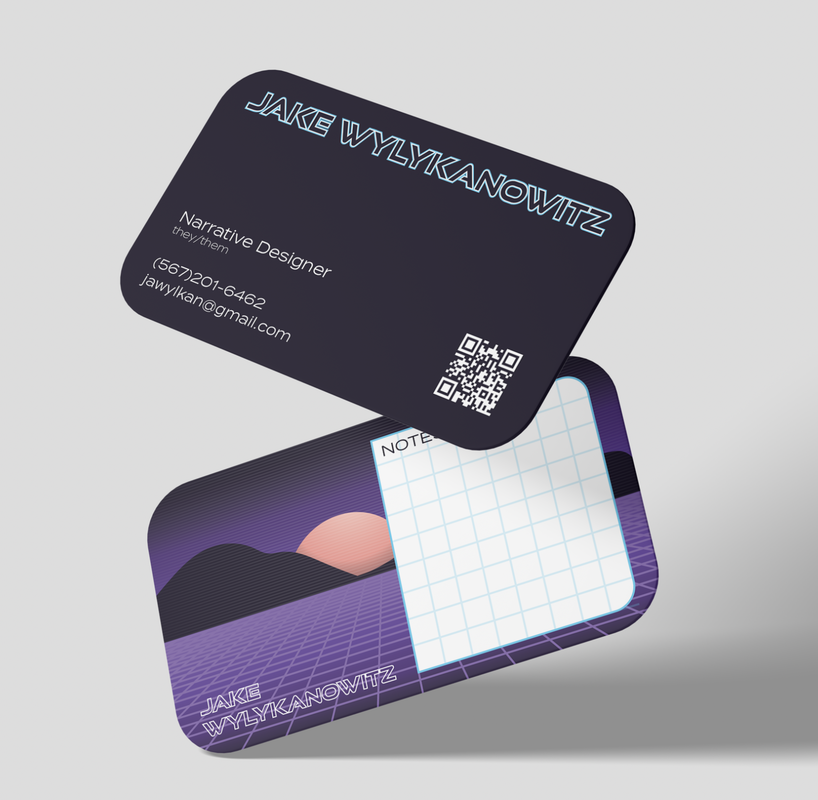
Jake Wylykanowitz

3/18/2024

0 Comments

 
Picture
0 Comments

The Bespoke Beard Company

11/15/2023

0 Comments

 
Picture
Picture

Project brief

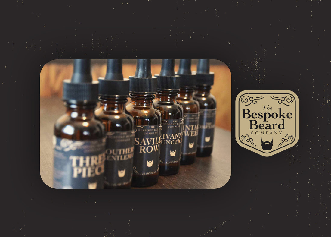
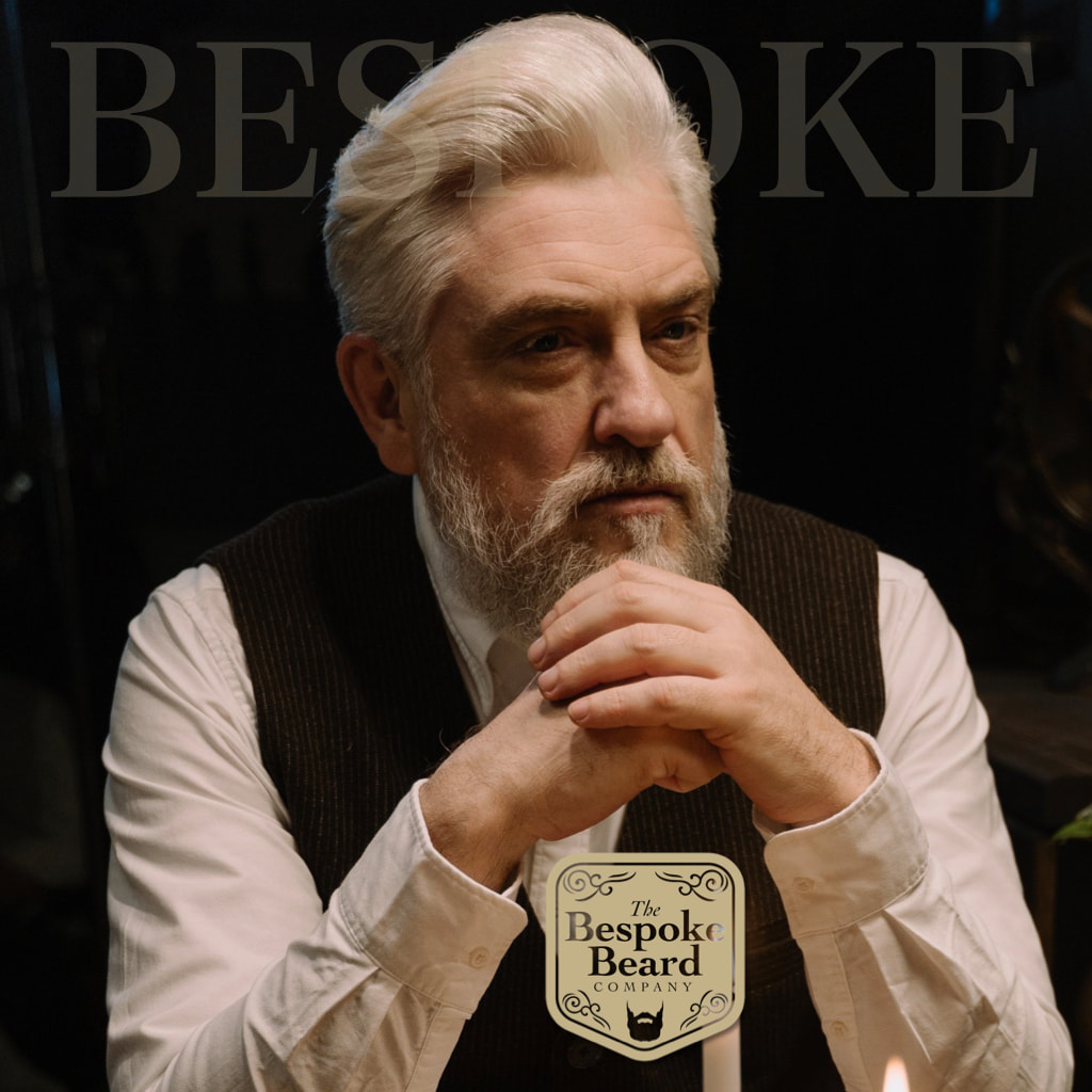
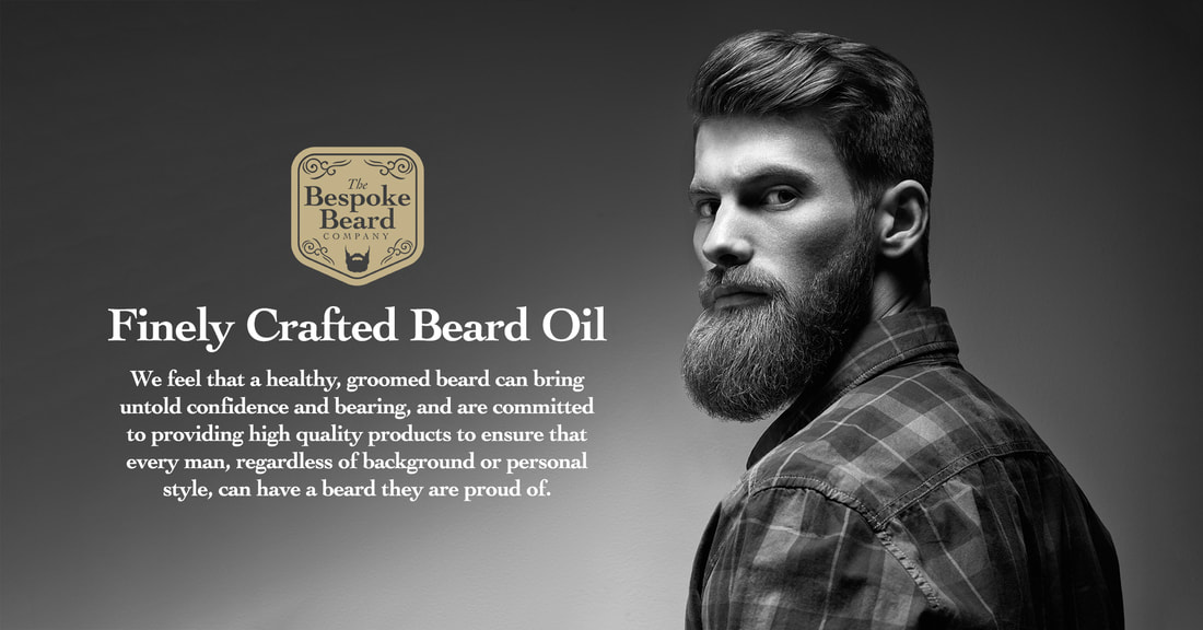
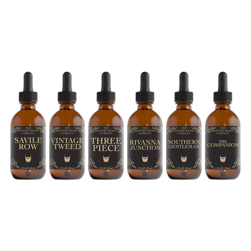
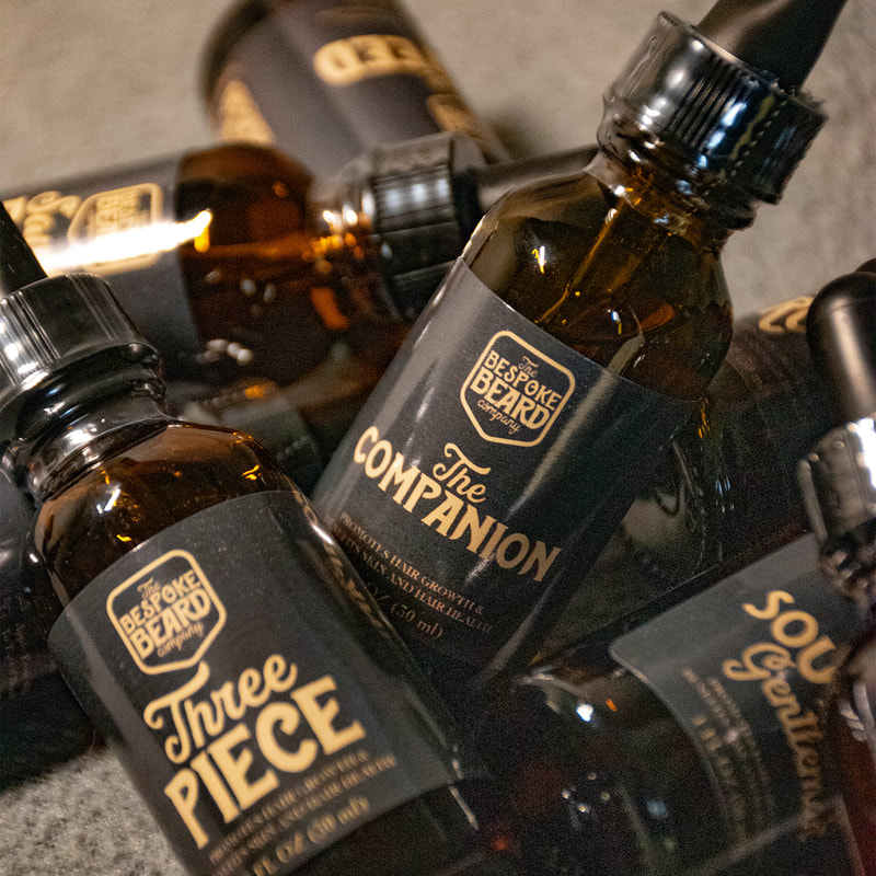
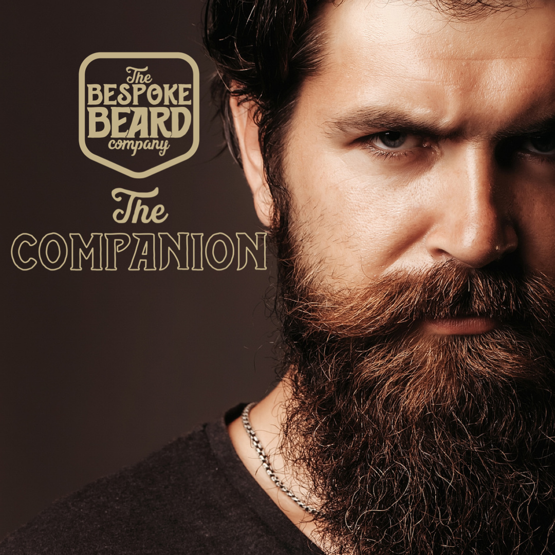
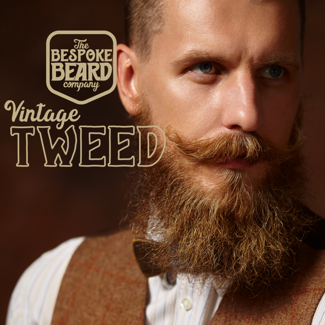
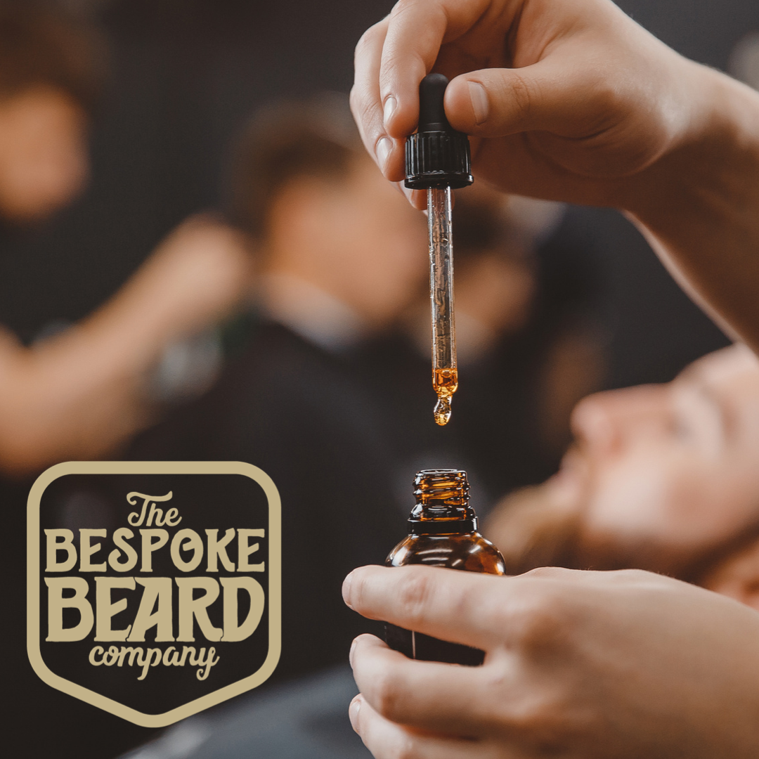
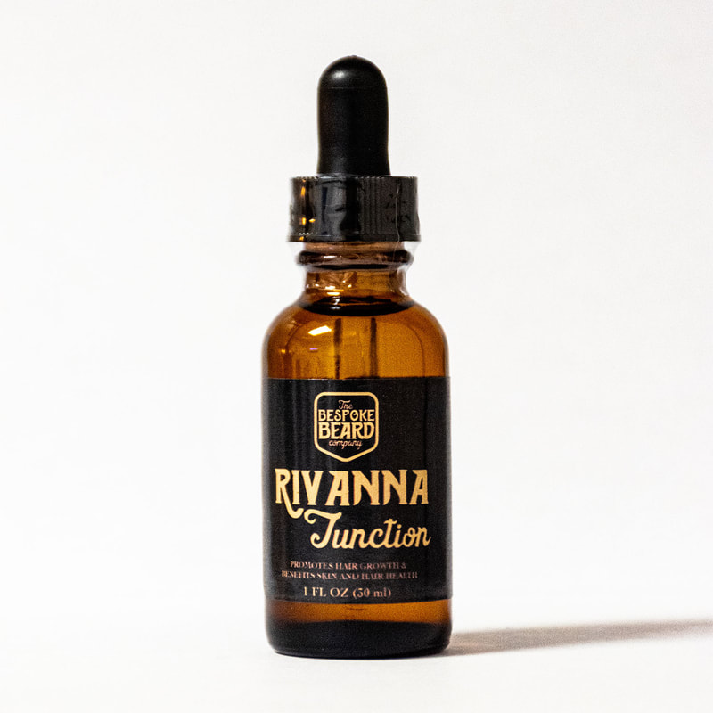
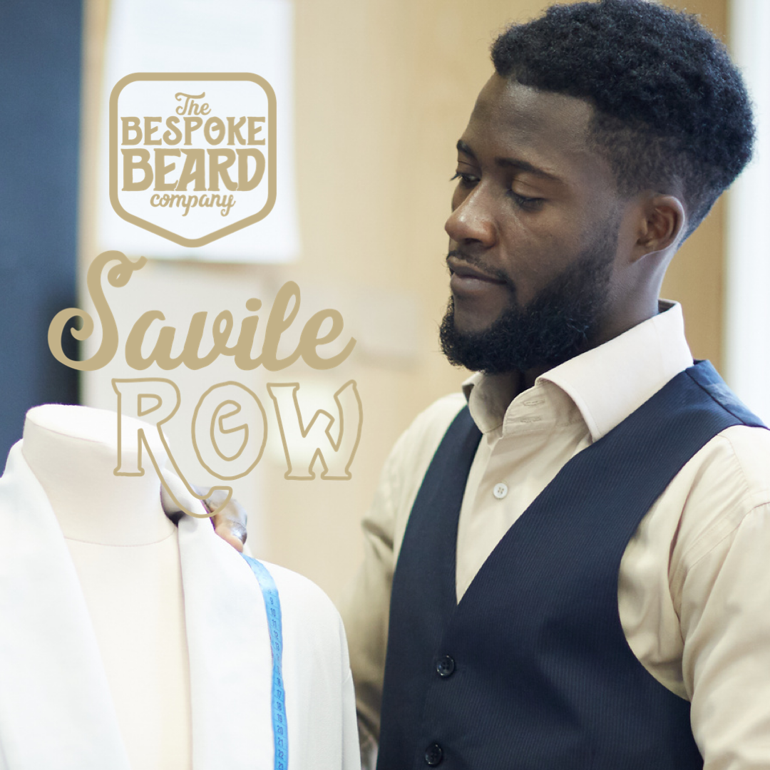
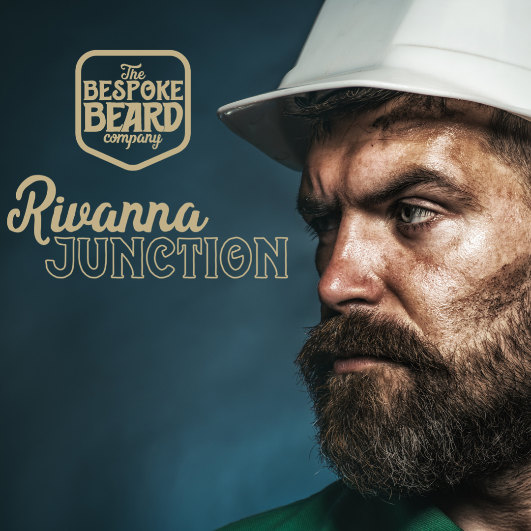
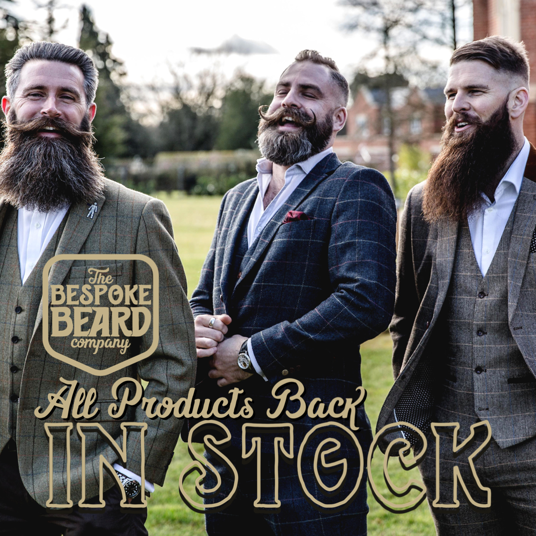
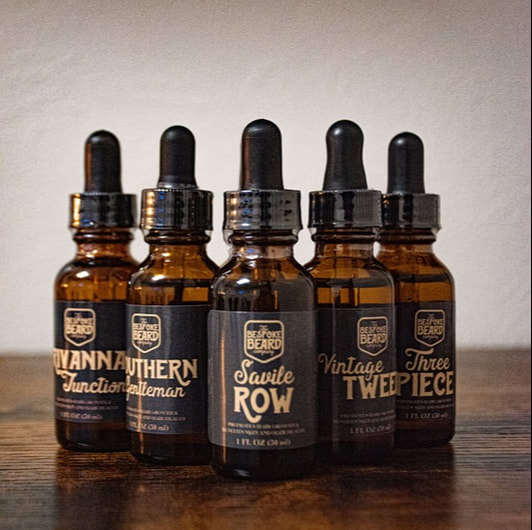
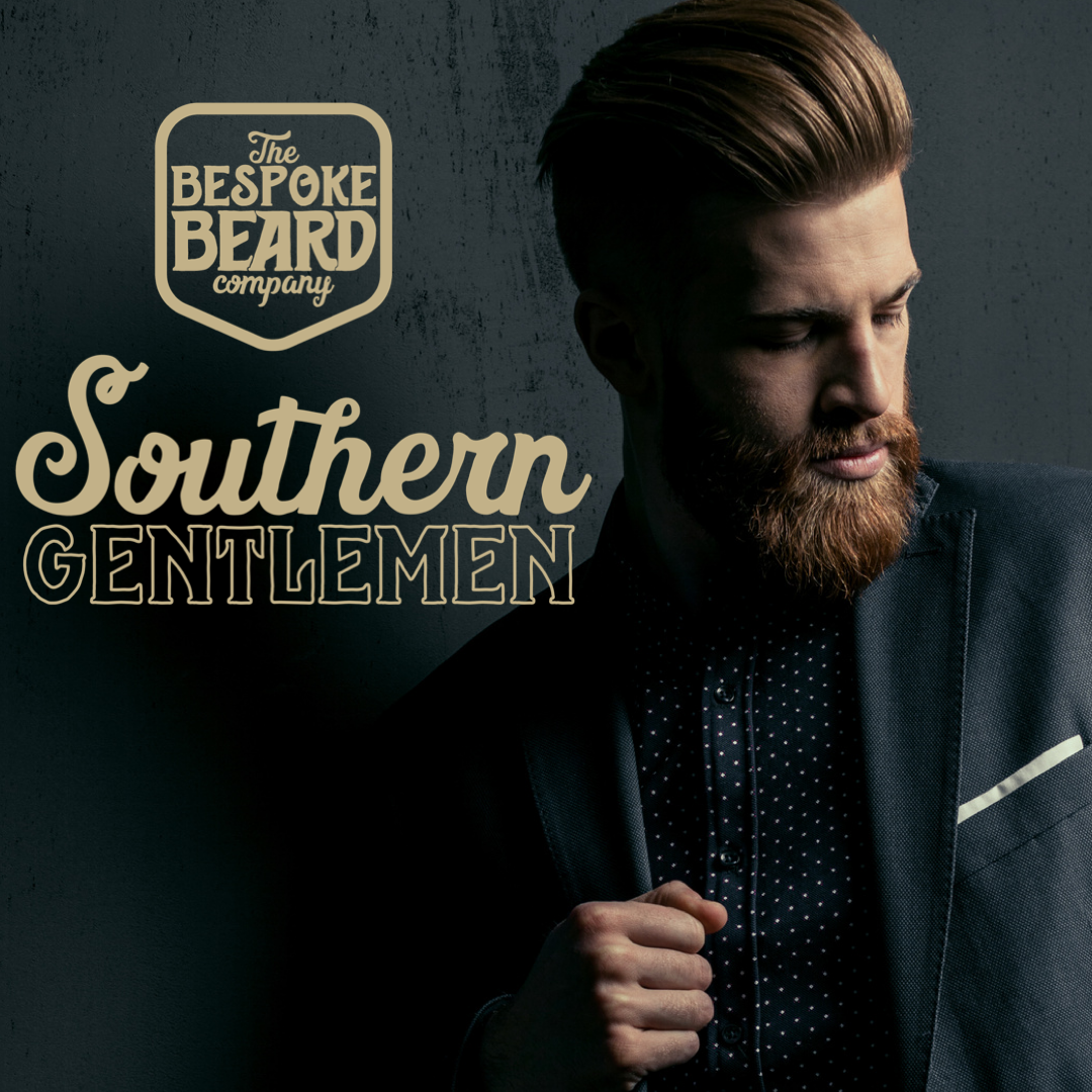
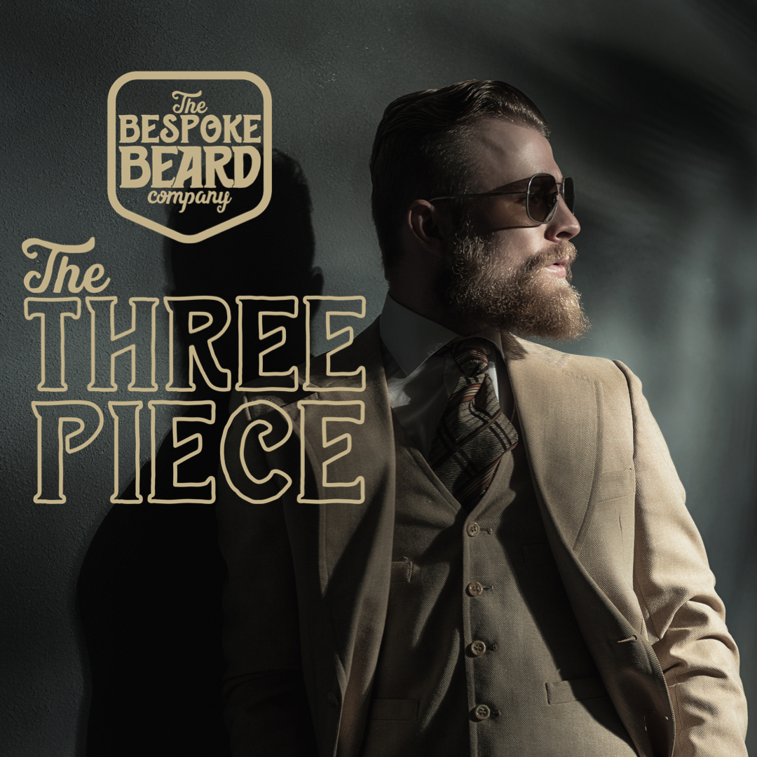
At the Bespoke Beard Company, their dedication to crafting exceptional beard care products is matched with our commitment to delivering a seamless and distinctive brand experience. From the inception of our logo to the creation of a user-friendly website, and the captivating photography that brings their products to life, every aspect of the brand has been meticulously curated. The logo, with its intricate design, reflects the precision and care they invest in their beard products. The website is a reflection of Bespoke Beard's commitment to providing a smooth, informative, and enjoyable shopping experience for their customers. Additionally, Bespoke Beard's engaging social media presence and targeted marketing efforts are expertly managed to ensure that the message reaches every man who aspires to cultivate a beard they can truly be proud of. The Bespoke Beard Company is not just a purveyor of high-quality products, but a lifestyle brand that embraces and enhances the essence of every man's beard journey. Check out their website!

the process

Picture
Picture
Picture
Picture
Picture
Picture
Picture

final versions & deliverables

Picture
Picture
Picture
Picture
Picture
Picture
Picture
Picture
Picture
Picture
Picture
Picture
0 Comments

The Original Doggie Bra

11/15/2023

0 Comments

 
Picture
Picture
Visit Doggie Bra

project brief

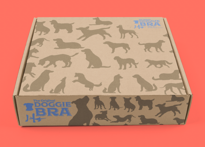
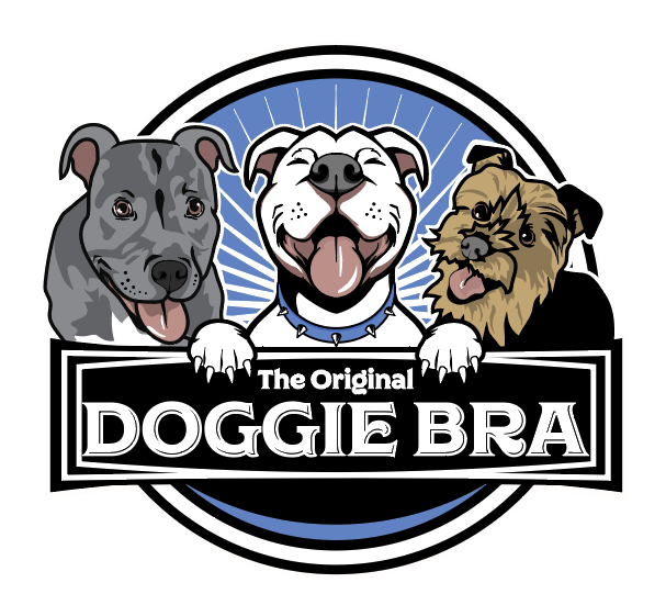
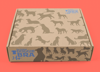
Our dedicated design team embarked on a journey to bring ShaLanna Watson's Doggy Bra brand to life. Inspired by a heartfelt encounter of a dog named Queenie and her litter of puppies, ShaLanna was moved to create a solution that would prioritize the health and comfort of female dogs. Our team brought this vision to life through logo, branding, packaging, and website design. Doggy Bra, approved by vets, prioritizes the well-being of female dogs. The simple and user-friendly branding and packaging reflect the product's innovation. The tagline, "Designed for your dog's health and comfort," emphasizes the commitment to canine care. Doggy Bra goes beyond a product; it represents the dedication to enhancing the lives of dogs and their owners. 

the process

Picture
Picture
Picture
Picture

final deliverables

Picture
Picture
0 Comments

Something New Events & weddings

11/15/2023

0 Comments

 
Picture
Picture

project brief

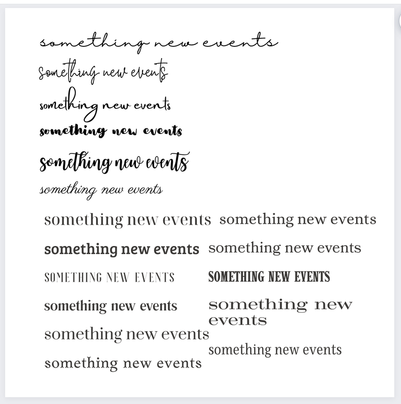
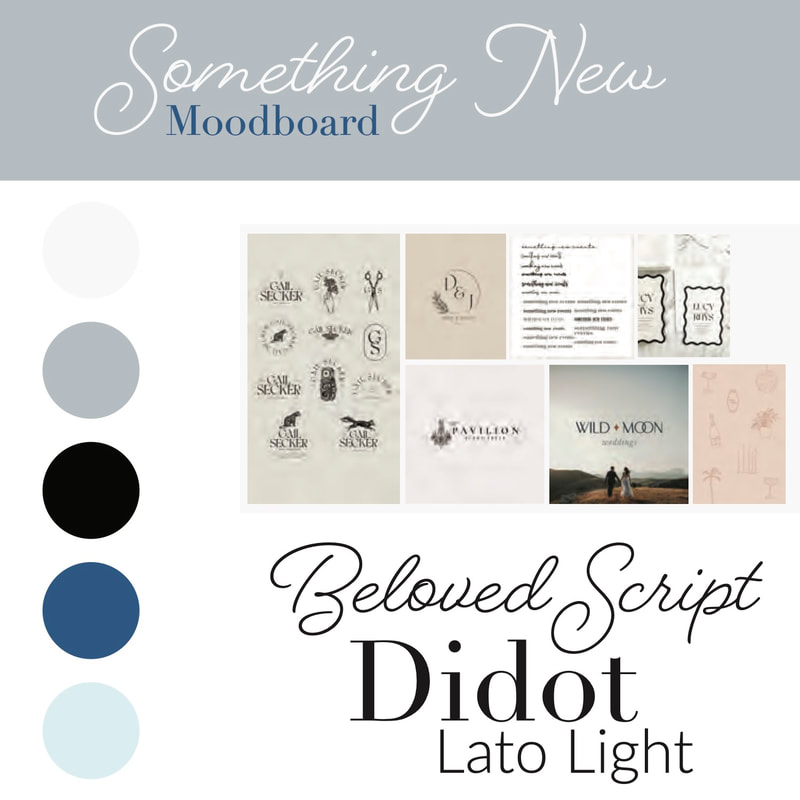
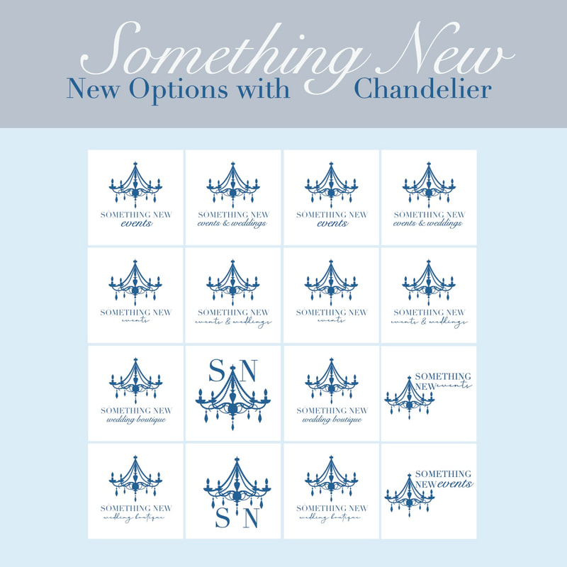
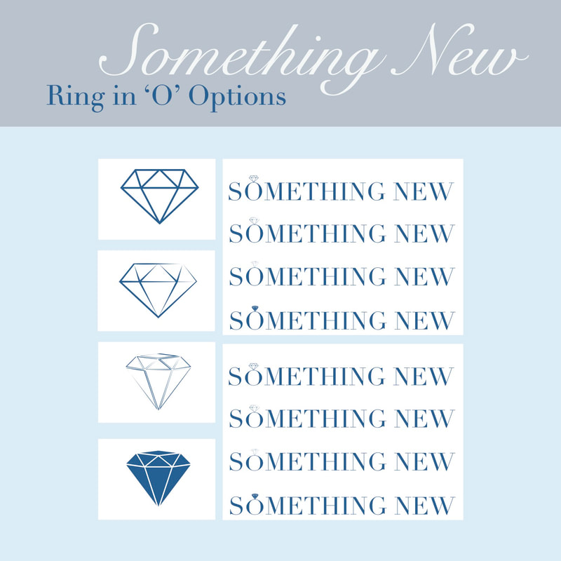
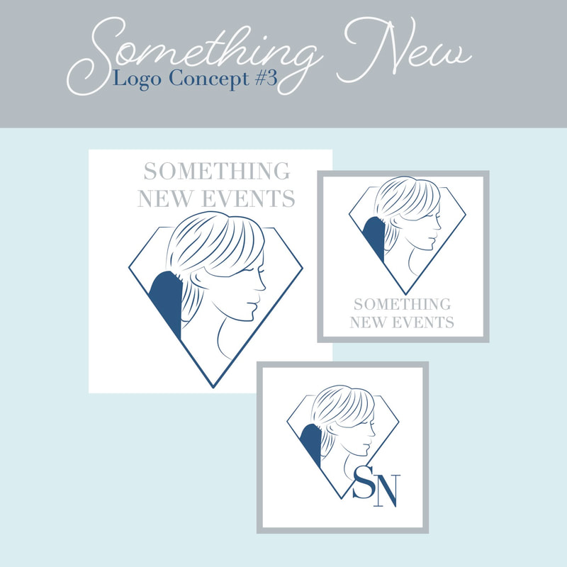
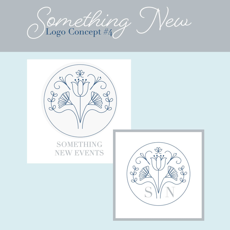
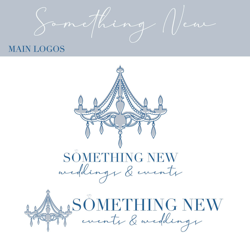
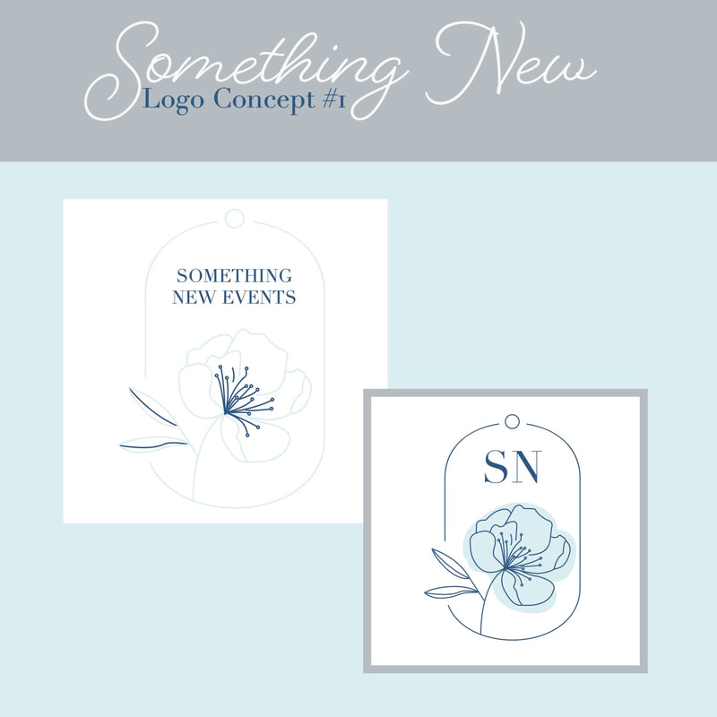
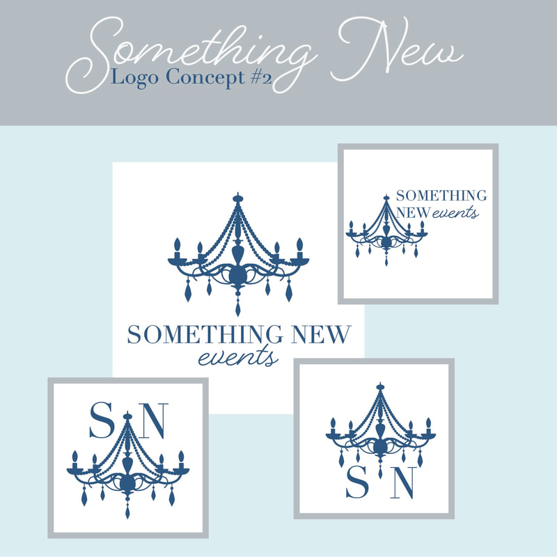
Bryttni Carpenter, a dynamic entrepreneur embarking on her journey to establish a wedding planning business that exudes modernity, creativity, and timeless elegance. Bryttni is driven by her passion for bringing joy through service, and she envisions a brand that mirrors her fun and creative personality. Collaborating with Bryttni, our team at Ape Forge delved into crafting an overall brand identity that not only encapsulates her values but also sets the stage for a modern, forward-thinking approach to wedding planning. We meticulously designed a logo that serves as the visual cornerstone of her brand, representing the fusion of fun, creativity, and timelessness. Through our collaboration, we aimed not only to establish a strong brand foundation but also to create a visual identity that resonates with Bryttni's unique vision and paves the way for future endeavors.

process

Picture
Picture
Picture
Picture
Picture
Picture
Picture
Picture
Picture
Picture
Picture
Picture

final versions

Picture
Picture
Picture
Picture
Picture
Picture
Picture
0 Comments

Sho'nuf Sippin

11/15/2023

0 Comments

 
Picture
Picture
Visit Sho'nuf Sippin

project brief

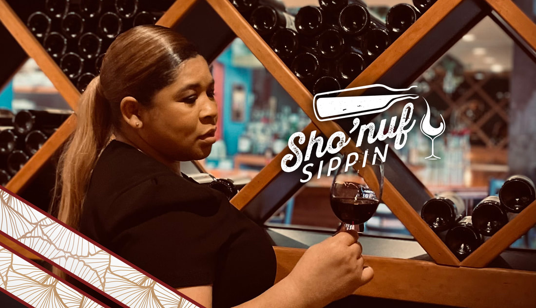
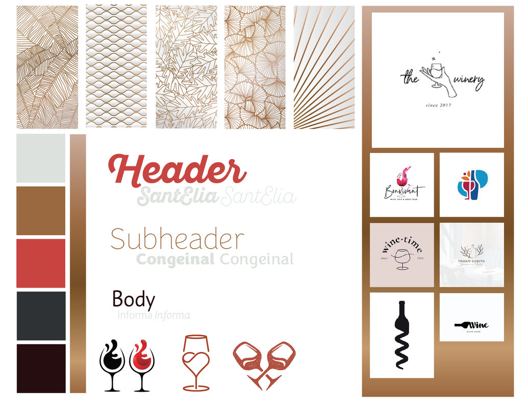
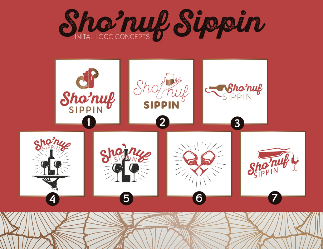
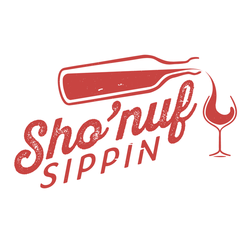
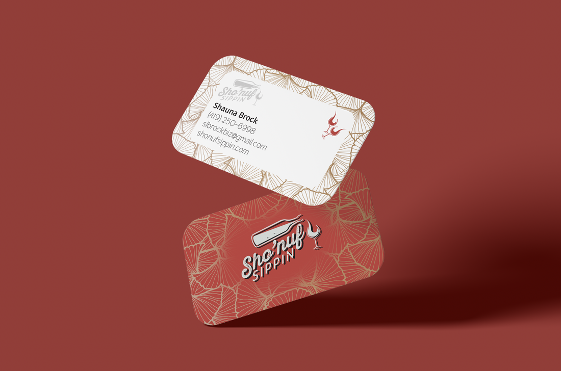
Shauna Brock, founder of Sho'nuf Sippin, sought our expertise to create a website and brand identity. We collaborated closely with Shauna to design a logo that encapsulates their essence and branding that resonates with their vision of "where fun meets elegance." Additionally, we transformed their online presence by developing a dynamic and user-friendly website. Our creative input not only addressed their needs but also ensures that every visual element, from the logo to the website, seamlessly reflected Sho'nuf Suppin's commitment to delivering an exceptional and memorable wine experience for everyone. Check out their website!

the process

Picture
Picture

final versions & deliverables

Picture
Picture
Picture
Picture
Picture
Picture
Picture
Picture
0 Comments

Speek Geek

11/15/2023

0 Comments

 
Picture
Picture

Project brief

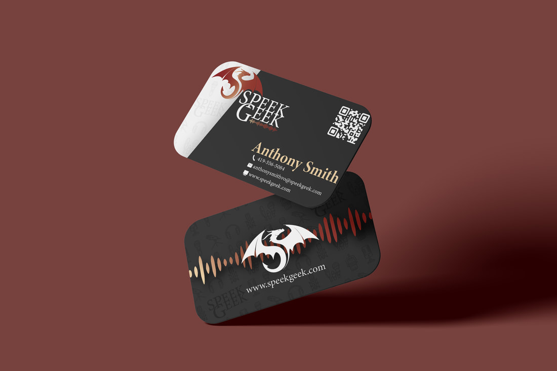
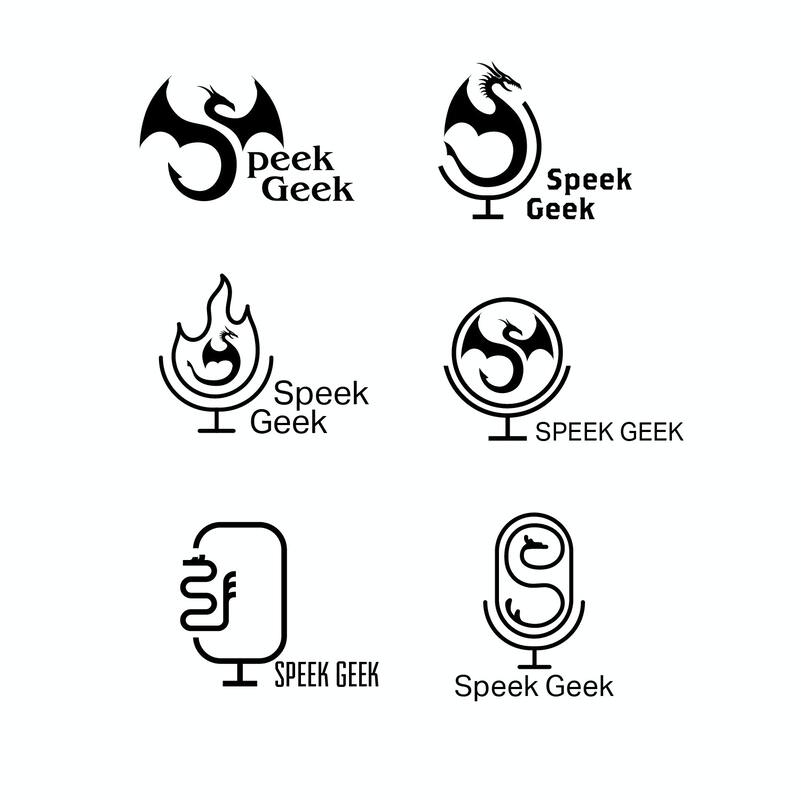
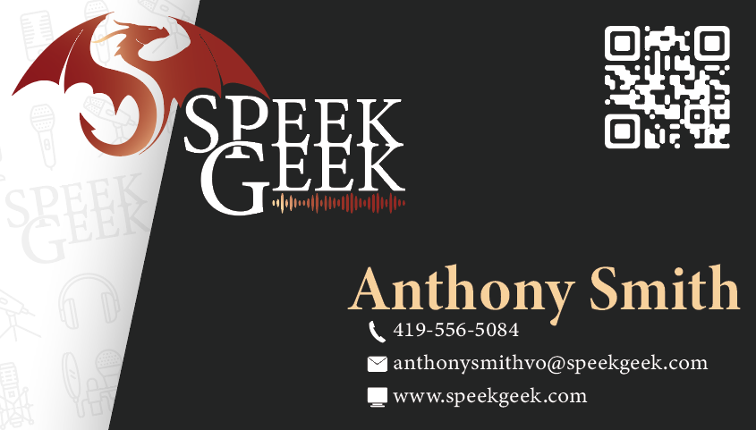
Introducing SpeekGeek, a platform that seamlessly blends technology and creativity, led by Anthony Smith, the voice-over artist. When Anthony approached us for a logo design, his passion was evident. Collaborating closely, Anthony and our team crafted a logo that not only represents the core values of SpeekGeek but also captures the essence of its forward-thinking approach. This collaboration reflects the dedication to ensuring that every detail aligns with the brand's identity, establishing SpeekGeek as a standout presence in the dynamic intersection of technology and design. 

the process

Picture
Picture
Picture
Picture

final version & deliverables

Picture
Picture
Picture
0 Comments

Ptero Business Solutions

11/15/2023

1 Comment

 
Picture
Picture

Project Brief

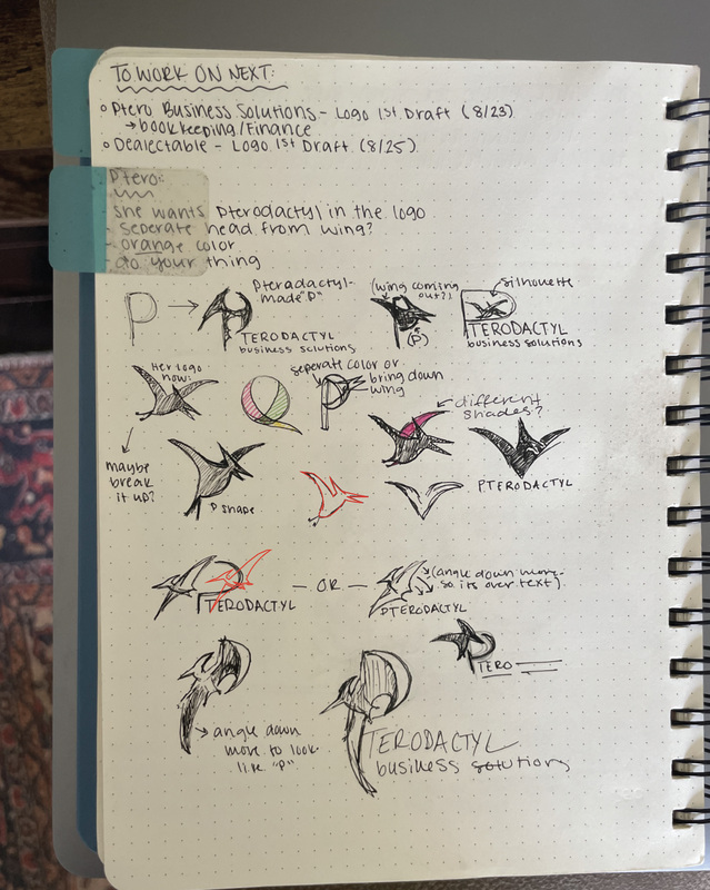
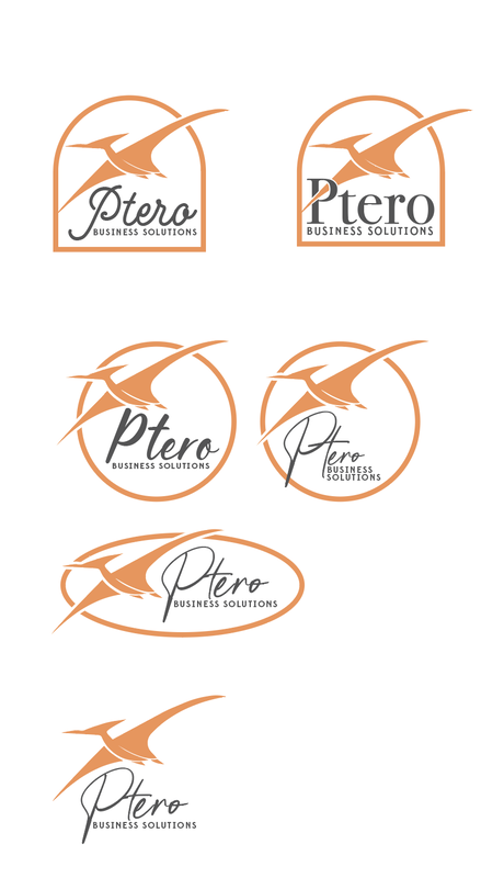
"Make the Pterodactyl chubby" was the graceful wording given to our creative team. Ptero Business Solutions, a full-service, virtual bookkeeping firm, approached Ape Forge with the goal of revamping their digital presence to better reflect their no-fuss, efficient, and comprehensive bookkeeping services. Their objective was to appeal to busy entrepreneurs across America seeking reliable financial management without sacrificing equity.

Challenge:
The primary challenge was to encapsulate Ptero's ethos - “No Fuss Bookkeeping” - into a web design that resonates with the target audience: busy entrepreneurs and small business owners. The site needed to communicate Ptero’s role as a trusted financial partner, emphasizing their expertise in alleviating tax season stress and aiding business growth.

Our team also guided the Ptero team on developing their own website with our web editor. This kept their cost of service low and also educated them on how to manage their own website.
Visit Website

The Process


Final Deliverable

1 Comment

Easy Jump

11/15/2023

0 Comments

 
Picture
Picture

Project brief

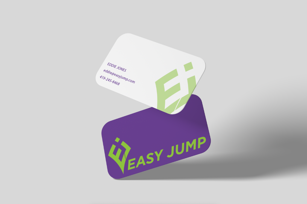
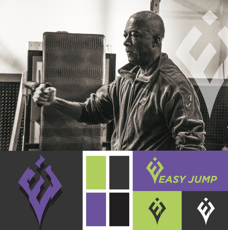
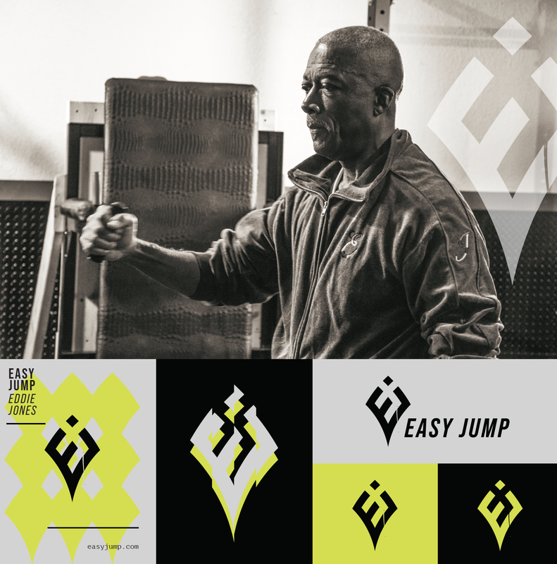
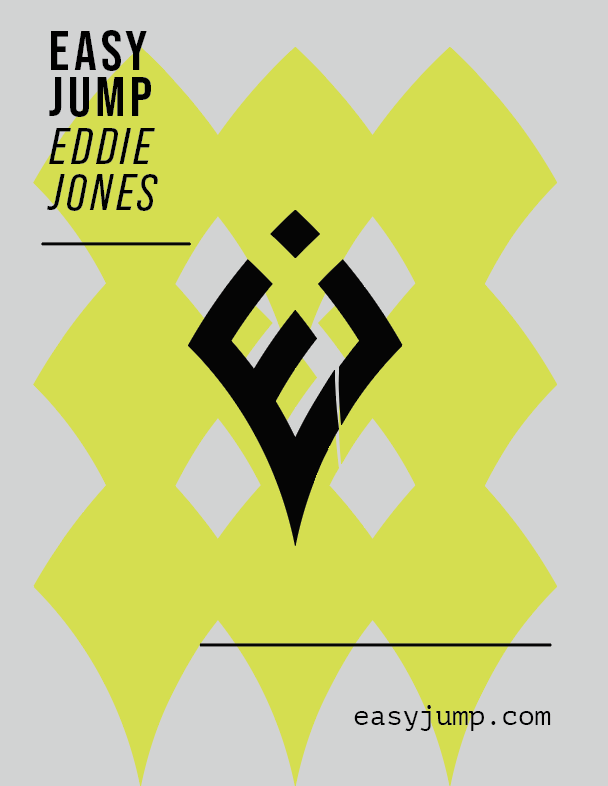
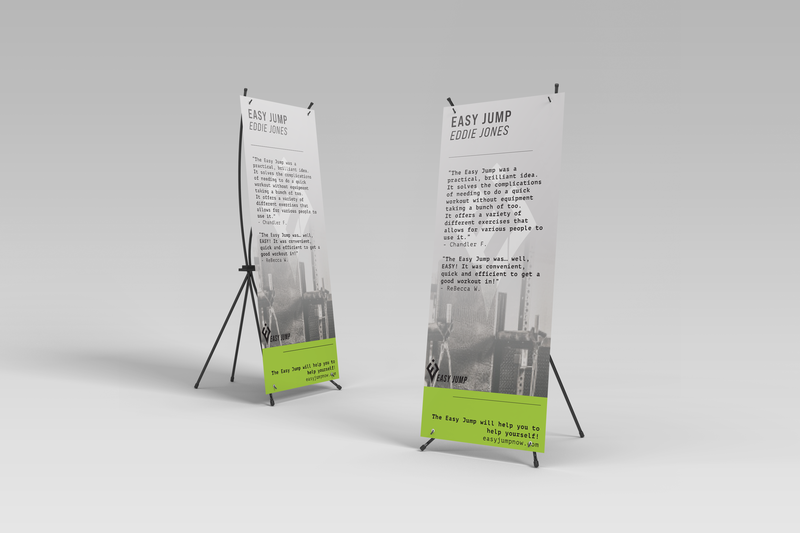
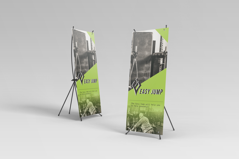
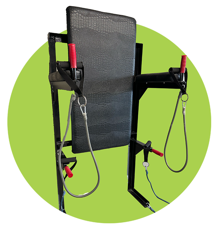
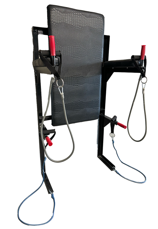
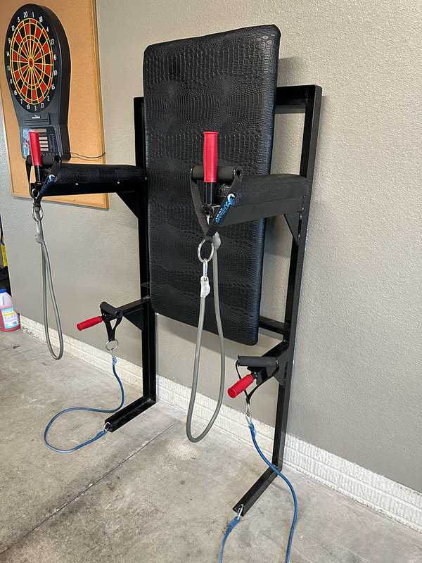
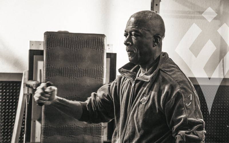
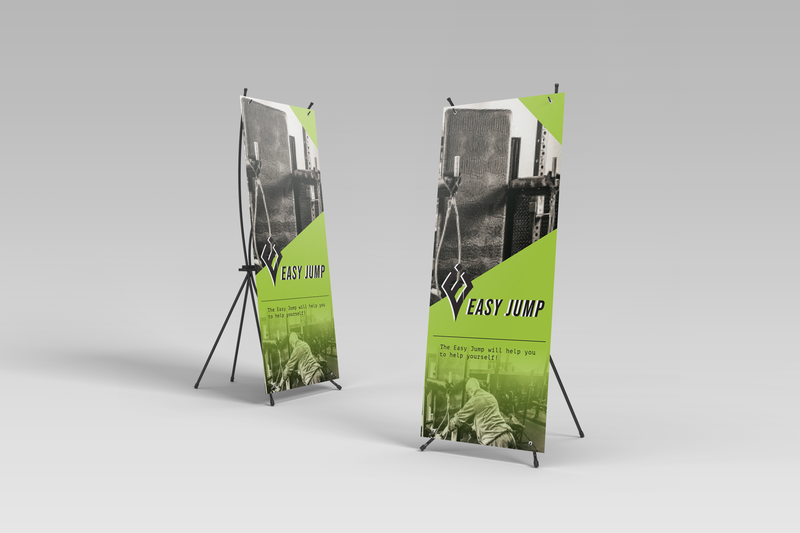
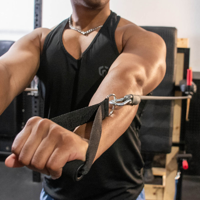
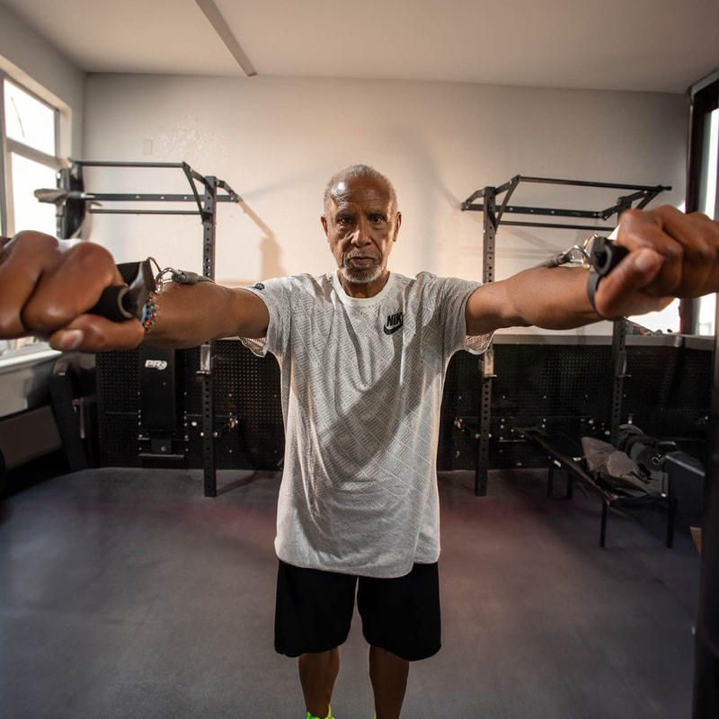
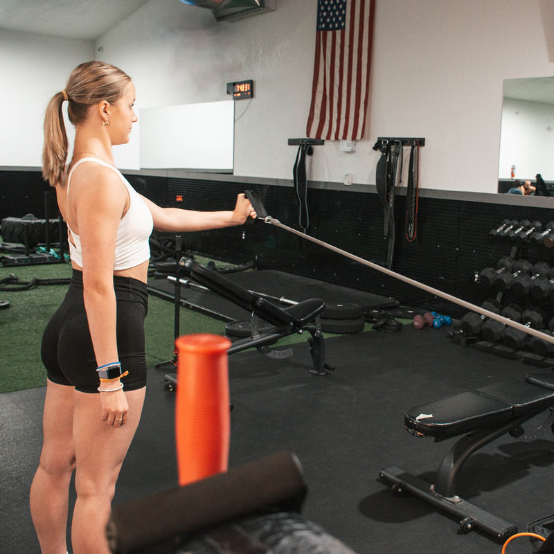
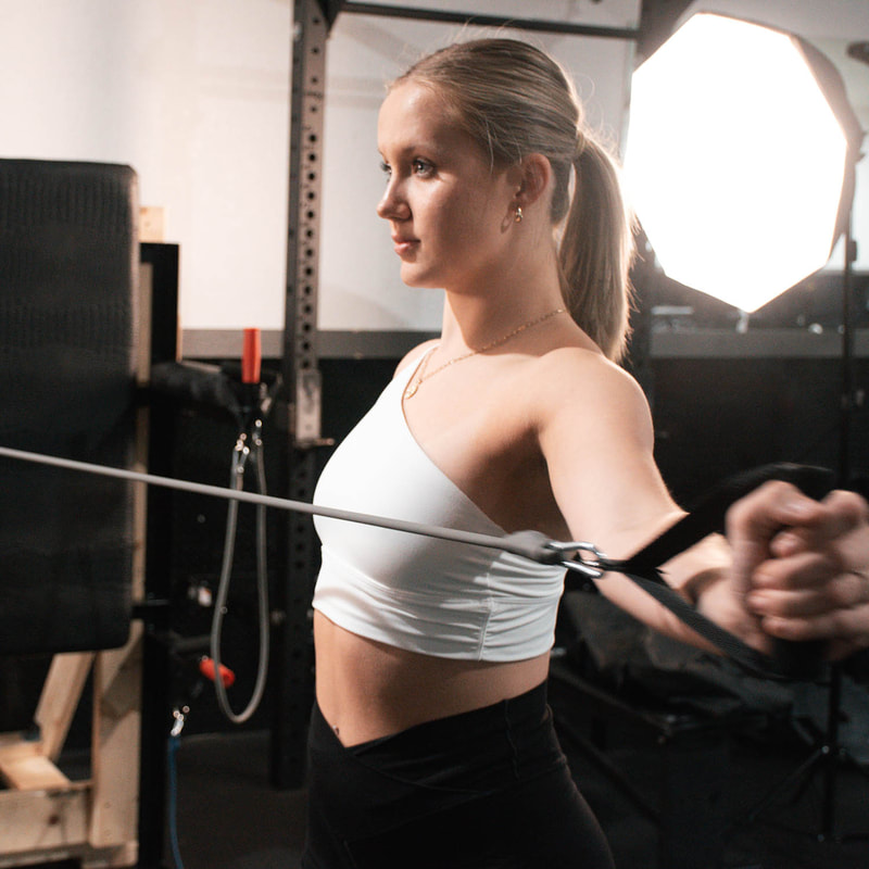
Eddie Jones, the innovator behind the Easy Jump System, approached Ape Forge with a clear vision: to create a compelling and memorable brand identity for his groundbreaking fitness invention. The Easy Jump System, a versatile, wall-mounted exercise equipment, needed a brand image that would encapsulate its unique benefits – versatility, space efficiency, inclusivity, and accessibility.
Visit Website
Objectives:
  • Develop a Strong Brand Identity: Craft a distinctive brand identity that resonates with a diverse audience, emphasizing the innovation, simplicity, and inclusivity of the Easy Jump System.
  • Design an Engaging Website: Create a user-friendly and visually appealing website that effectively communicates the benefits of the Easy Jump System and encourages customer interaction and purchases.
  • Marketing Materials Creation: Produce a range of marketing materials, including brochures, digital content, and packaging, aligning with the brand's identity.
  • Social Media Strategy: Develop a robust social media presence to enhance brand visibility and engagement.
  • Target Audience:
  • The Easy Jump System caters to a wide demographic, including fitness enthusiasts, individuals with limited space, older adults, and those undergoing rehabilitation. The brand identity must speak to this diverse audience, ensuring a universal appeal.

Brand Personality:
The brand should reflect qualities such as innovation, reliability, approachability, and inclusivity. The tone should be empowering, motivating, and friendly, mirroring Eddie Jones’s vision of making fitness accessible to everyone.

Visual and Design Elements:
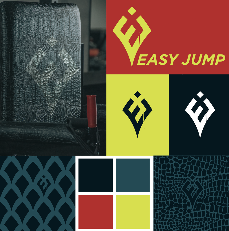
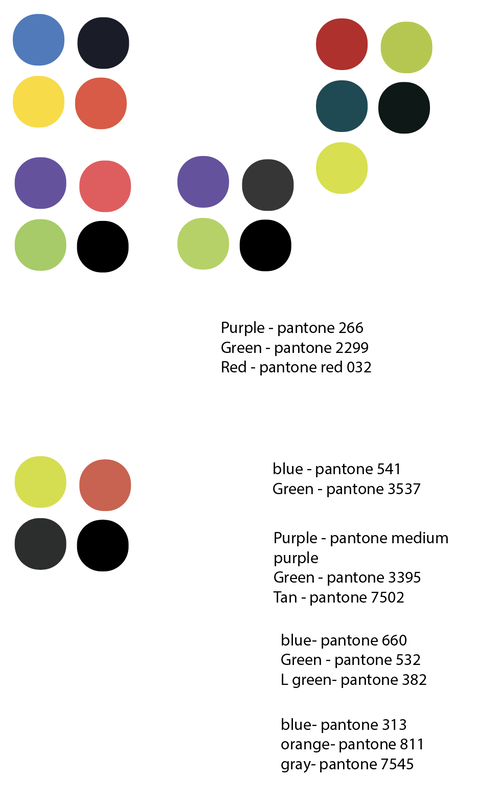
  • Color Palette: Choose a color scheme that conveys energy and positivity while maintaining a sense of trust and reliability.
  • Logo Design: The logo should be modern, clean, and easily recognizable, symbolizing movement and versatility.
  • Typography: Use clear, accessible fonts that align with the brand’s inclusive ethos.

Key Messages:
  • The Easy Jump System is a revolution in home fitness, offering a full-body workout in a compact, user-friendly format.
  • Emphasize the space-saving, versatile nature of the product, ideal for various living environments.
  • Highlight the inclusivity for all ages and body types, including those with physical limitations or in rehabilitation.

Expected Outcomes:
  • A cohesive and compelling brand identity that effectively communicates the Easy Jump System’s unique selling points.
  • Increased brand awareness and engagement across various channels, particularly digital platforms.
  • A surge in customer inquiries and sales following the brand launch and marketing campaign.

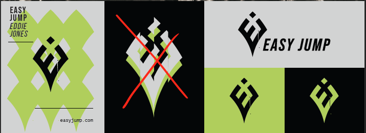
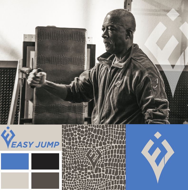
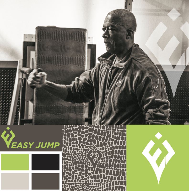
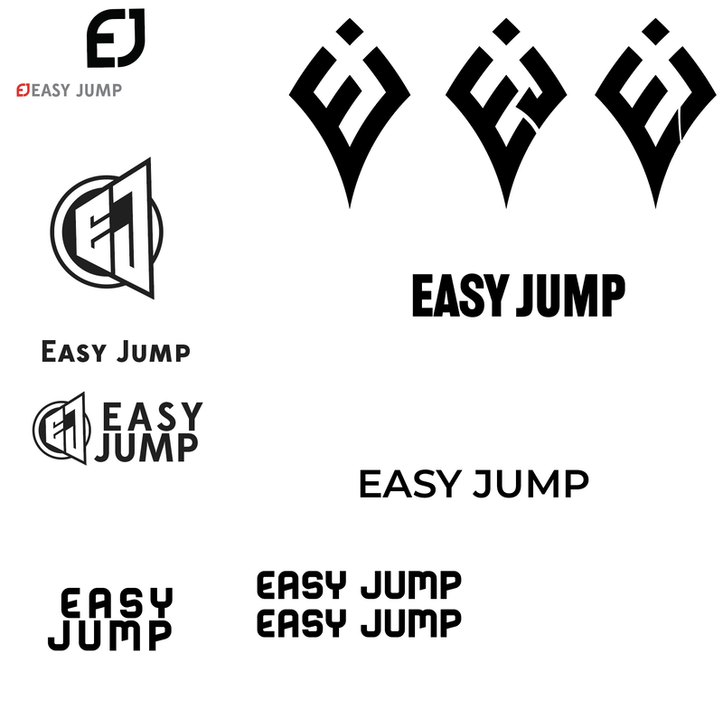
The Process

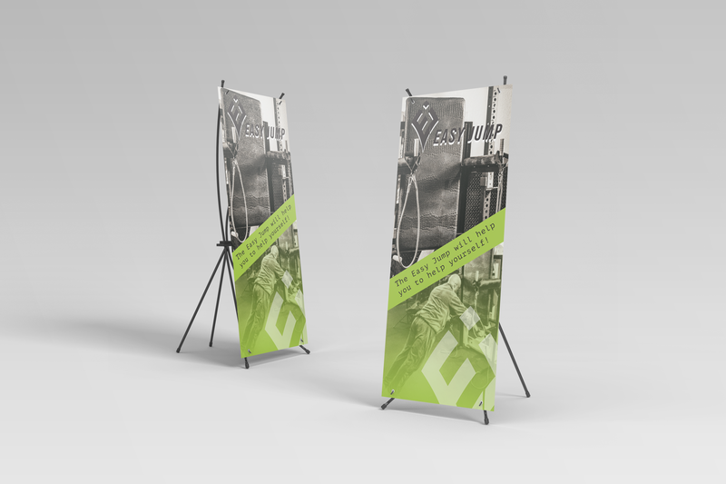
Eddie Jones’s partnered with Ape Forge to transform the Easy Jump System from an invention into a powerful and recognized brand.

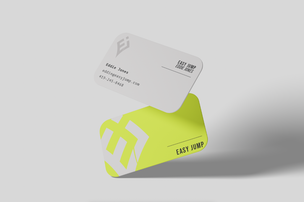
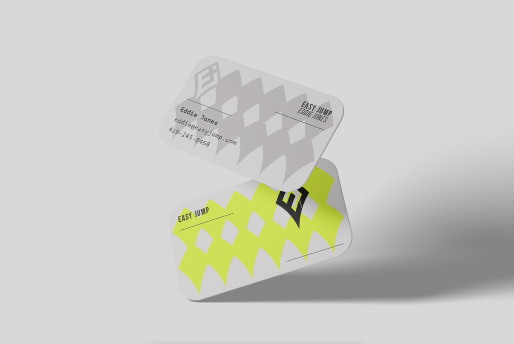
Final Versions & Deliverables

0 Comments

    Project Types

    All
    App Design & Development
    Branding
    Digital Marketing
    Graphic Design
    Photo Capture & Editing
    Social Media Management
    Video Capture & Editing
    Web & ECommerce

    RSS Feed

Ape Forge
Ape Forge LLC BBB Business Review
406-317-2168 | [email protected]
111 N Higgins Ave Suite 204.06 F
​Missoula Montana 59802
© Ape Forge LLC 2019 - | All Rights Reserved
Get In Touch

​Contact Us
Schedule A Meeting
Download Our App

Mumbo-Jumbo

​Creative Service Agreement
​Make A Payment
​Add Funds To Your Journey
Pay For Website Hosting
​Billing Portal
​​Policies

Adventure With Us

Join The Team
Become A Referral Partner
​
Strategic Partnership
Accessibility Tool
Built with love by Ape Forge
  • Expedition
  • Journey
  • What We Do
    • Branding & Graphic Design
    • Websites & eCommerce
    • Apps Design & Development
    • Photo & Video Capture
    • Digital Marketing
    • Guidance & Consultation
  • Our Work
  • Pricing
  • Final Draft
  • Events
    • Creative After Five
  • Contact Us