 In today’s competitive business environment, standing out from the crowd is crucial for success. Your brand speaks volumes about your business and its values, which is why effective branding is essential. At Ape Forge, we're passionate about helping businesses create a powerful and memorable brand identity. One of our recent and highly rewarding projects involved collaborating with Waters Cleaning, and it's a story worth sharing.
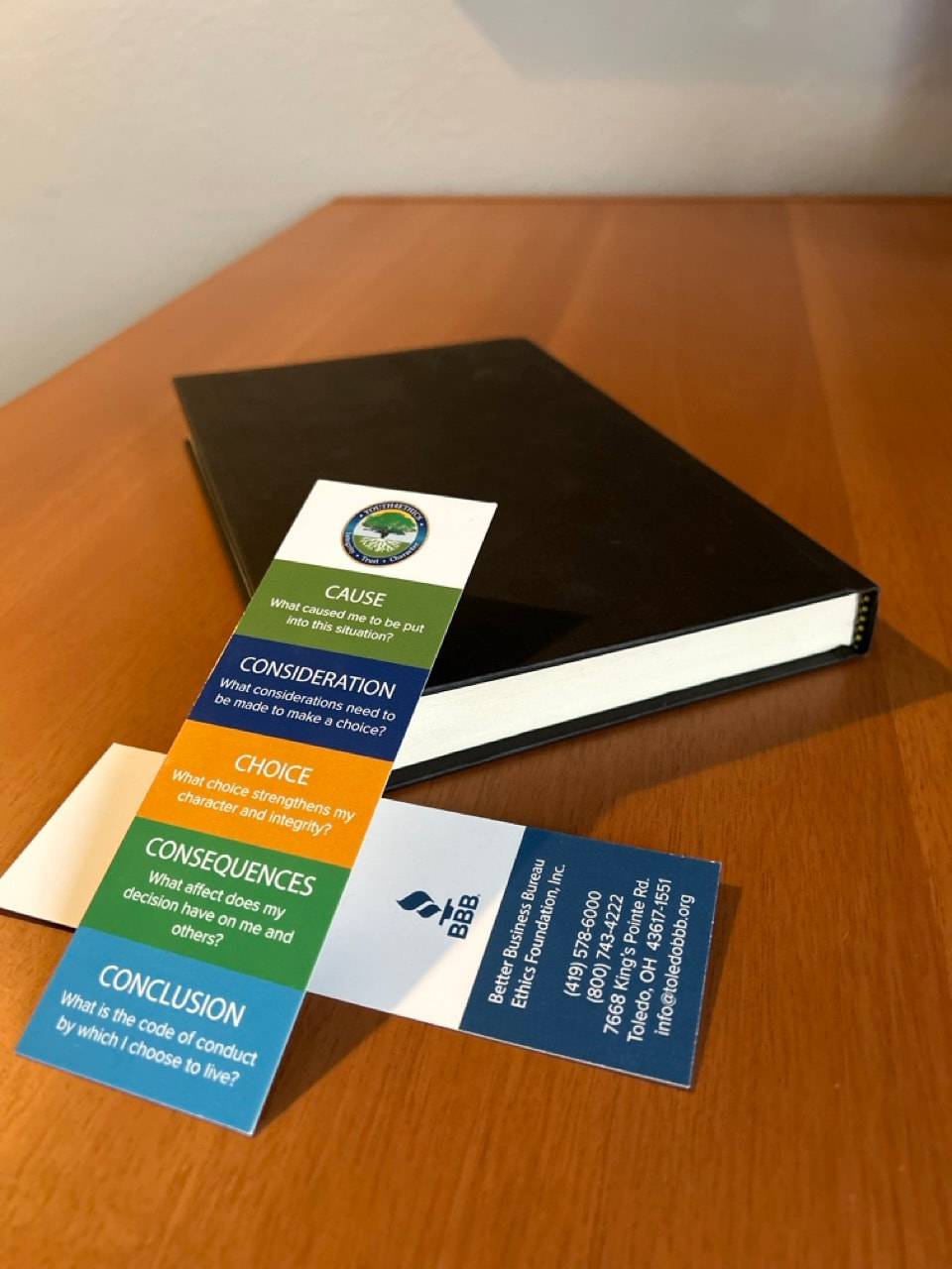
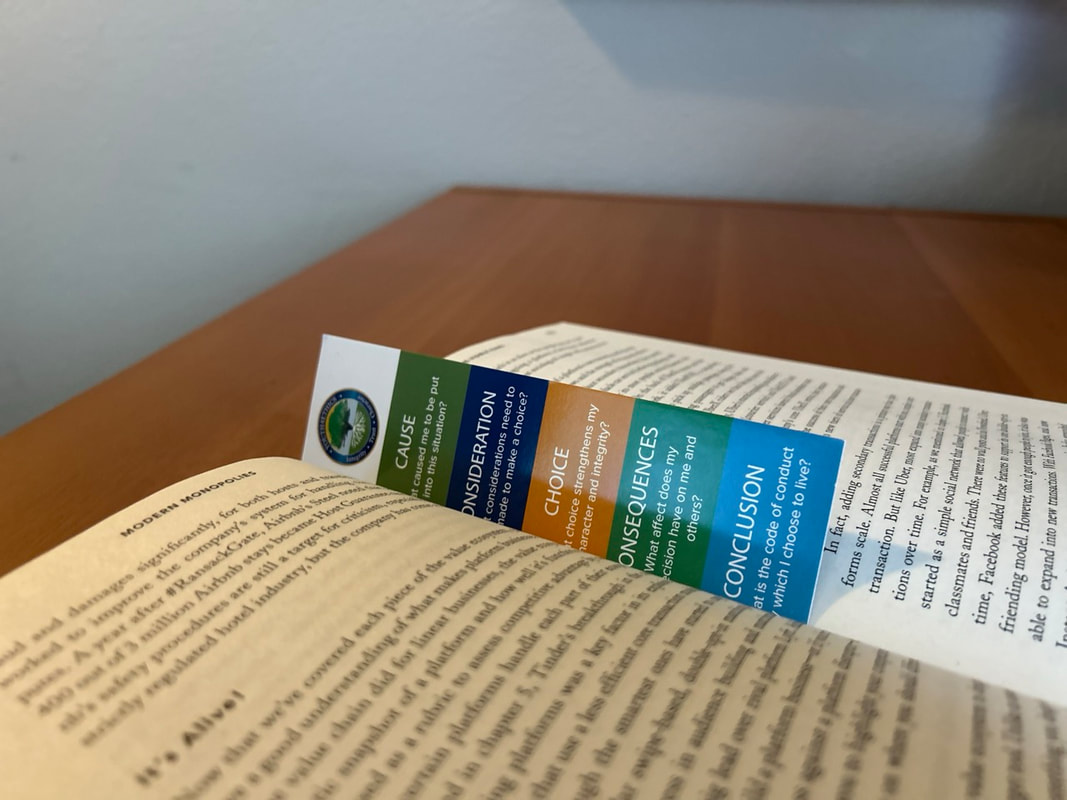
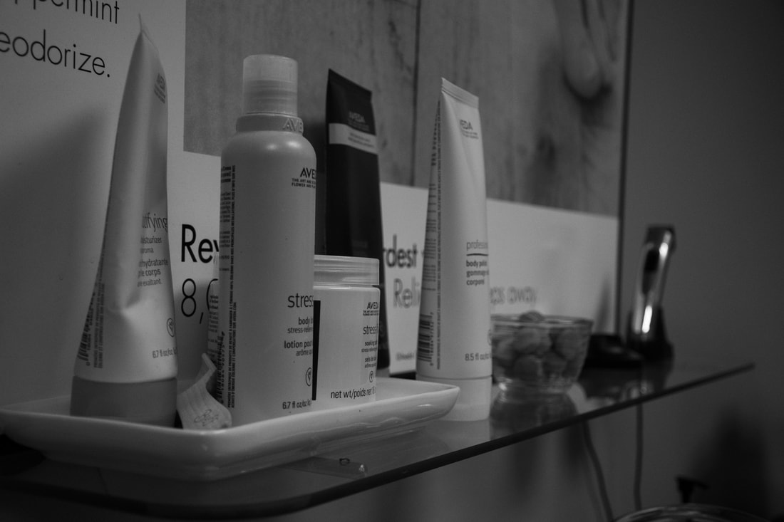
Understanding the Vision Waters Cleaning, a professional cleaning service based in Toledo, Ohio, approached us with a clear, yet challenging mission: they wanted to refresh their branding to better reflect their core values of reliability, professionalism, and attention to detail. As a company dedicated to providing pristine cleaning services, the Waters Cleaning team knew that first impressions start long before the actual service is delivered. Their visual identity needed to communicate trustworthiness and excellence right from the start. The Branding Journey
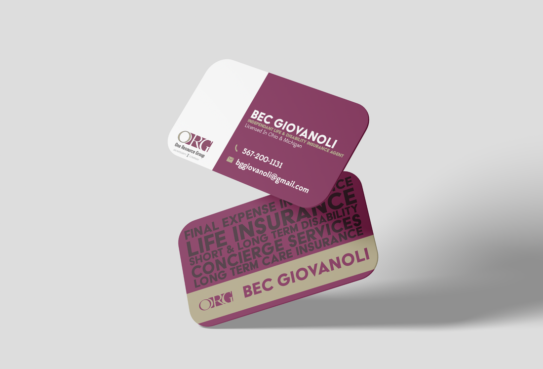
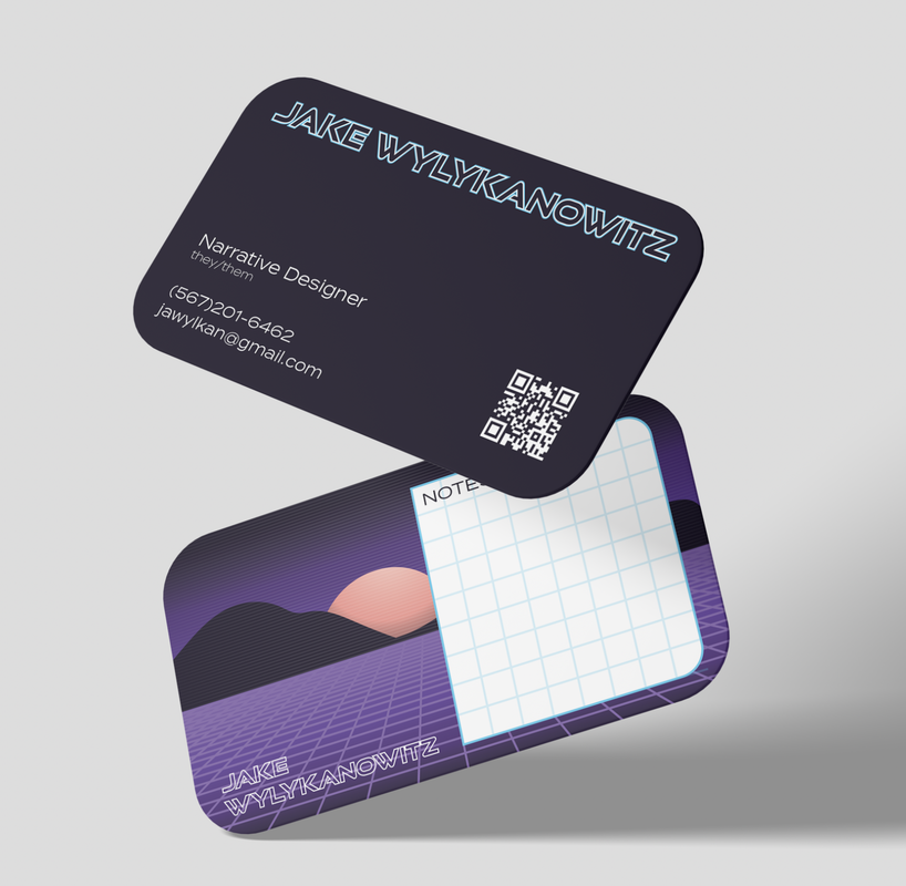
Implementation and Beyond Once the designs were finalized, we proceeded to print high-quality business cards that Waters Cleaning proudly distributed among their clients and prospects. Furthermore, we provided them with a cohesive brand guideline document to ensure consistency across all their marketing materials, from digital assets to physical collateral. A Partnership for Growth Working with Waters Cleaning has been a gratifying experience for the Ape Forge team. Their dedication to excellence aligns perfectly with our own commitment to producing creative solutions that drive success. This partnership highlights how thoughtful branding can significantly impact a business’s growth and client relationships. In today’s visually-driven world, your brand is more than just a logo or a set of colors—it’s an experience and a promise to your customers. By understanding and reflecting the true essence of Waters Cleaning, Ape Forge has helped them craft a visual identity that resonates with their audience and stands the test of time. Ready to transform your brand? Contact us at Ape Forge and let’s create something extraordinary together.
0 Comments
 At Ape Forge, we take pride in our role as creative catalysts, transforming brands and bringing visions to life. One of our standout partnerships has been with First Priority Restoration, a company dedicated to providing top-notch restoration services. Through our collaboration, we've offered them our expertise in graphic design, social media management, and digital marketing. Here’s a behind-the-scenes look at how we’ve supported First Priority Restoration in their journey toward achieving aesthetic excellence and digital prominence.
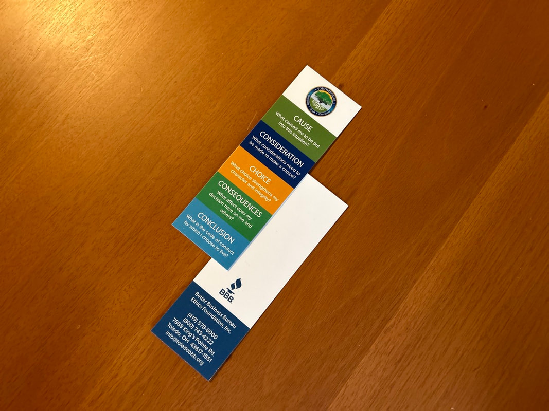
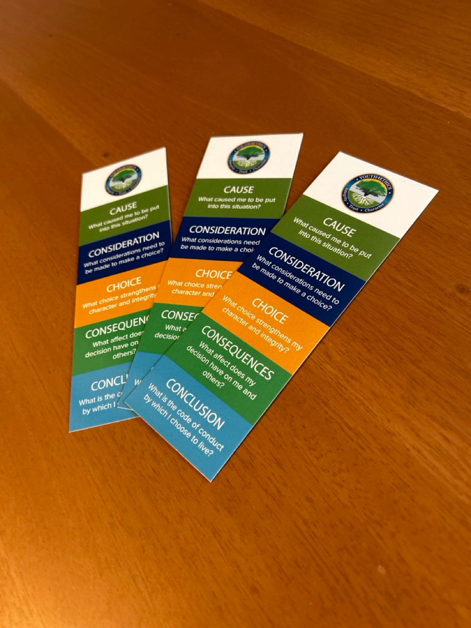
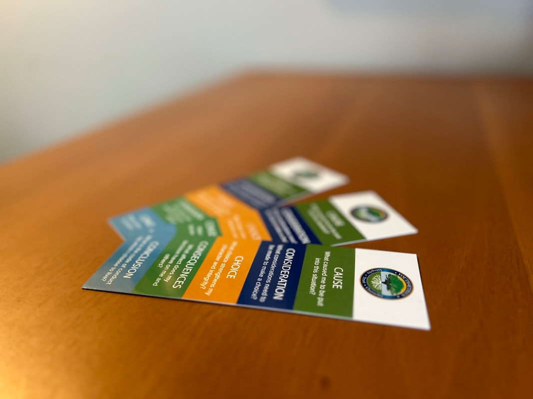
Graphic Design: Crafting Clear and Compelling Visuals
The collaboration between Ape Forge and First Priority Restoration serves as a testament to the transformative power of creative and digital marketing services. By focusing on tailored graphic design, robust social media strategies, and comprehensive digital marketing, we’ve helped them carve out a more compelling and engaging presence both online and offline. At Ape Forge, we believe in making our clients’ success stories our own. Working with First Priority Restoration has been a rewarding experience, and we look forward to continuing to support their growth and success in the future. If you’re looking for a creative agency that can elevate your brand through impeccable design and digital marketing strategies, look no further than Ape Forge. We're here to forge the path to your success. 
final deliverables
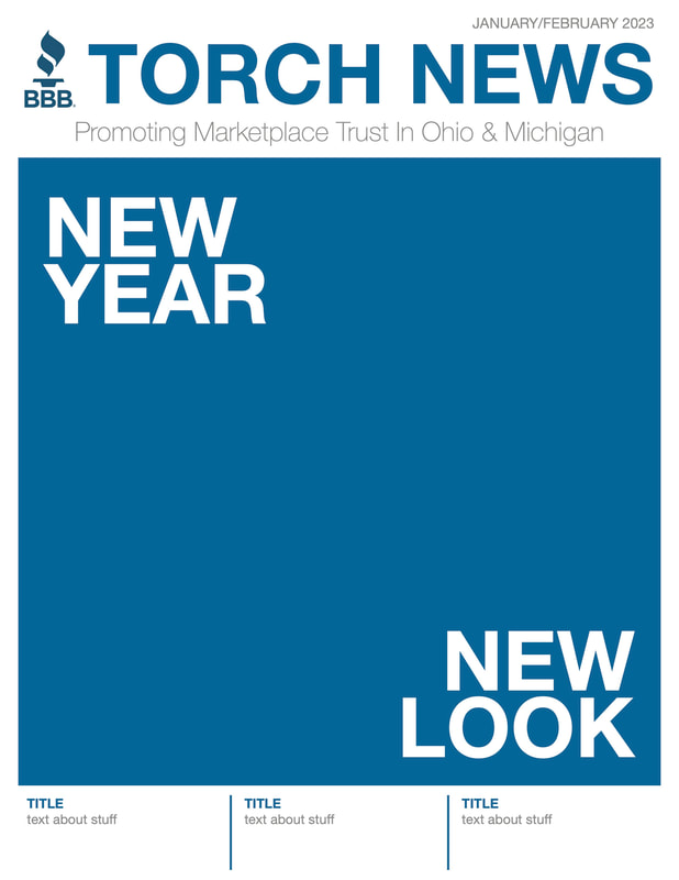
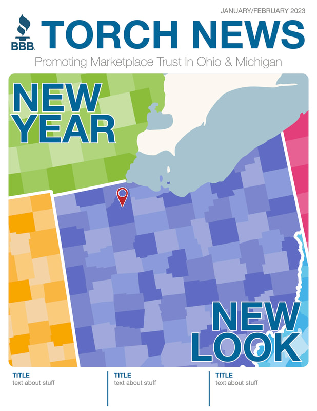
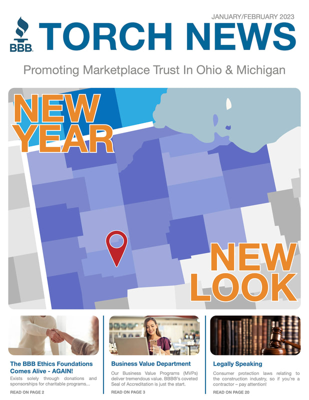
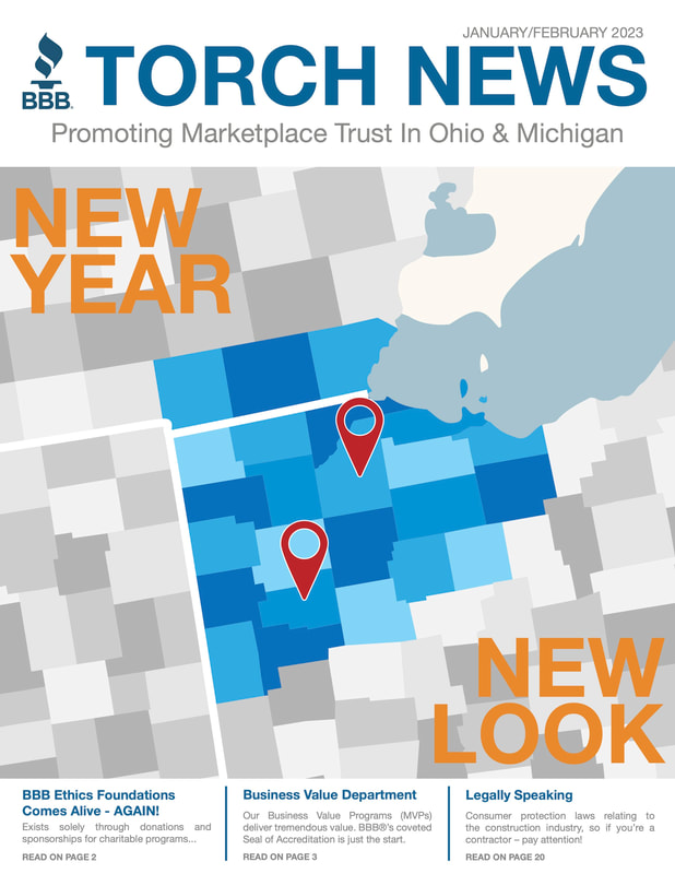
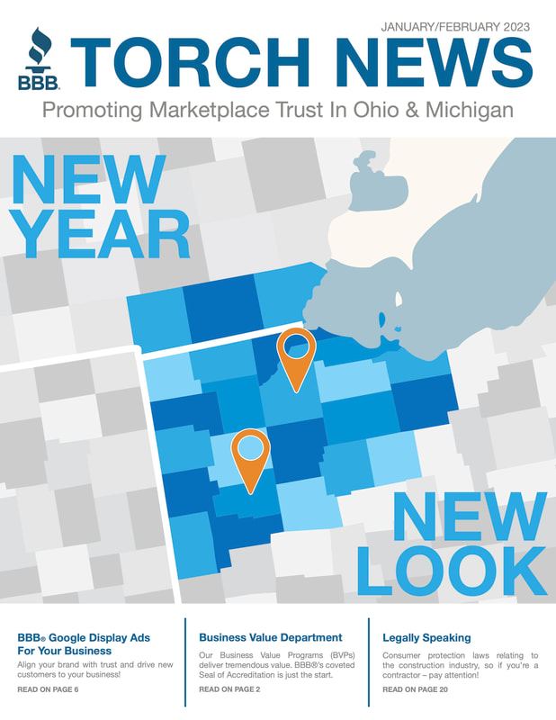
work in progressJanuary - February 2023 Newsletter Cover
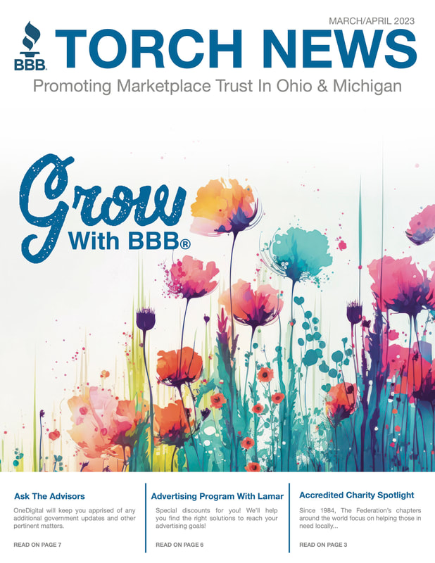
March - April 2023 Newsletter Cover
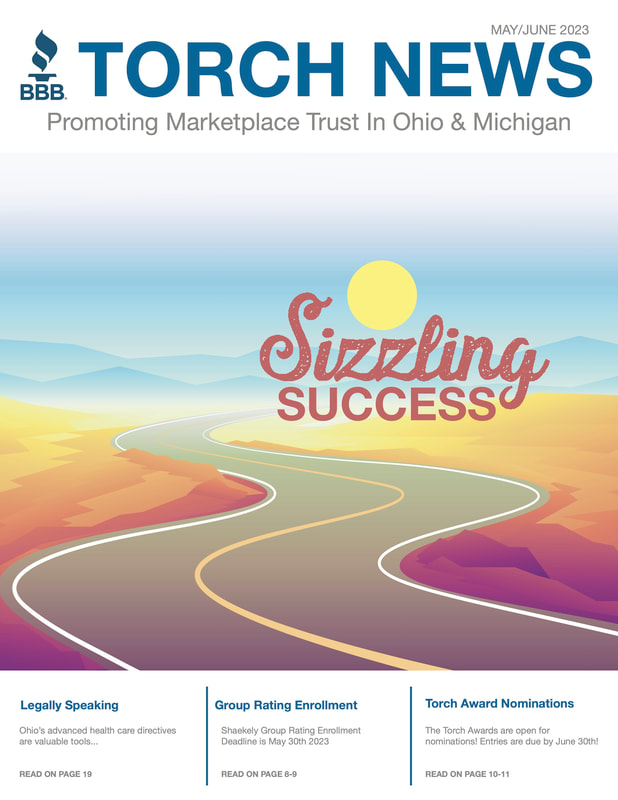
May - June 2023 Newsletter Cover
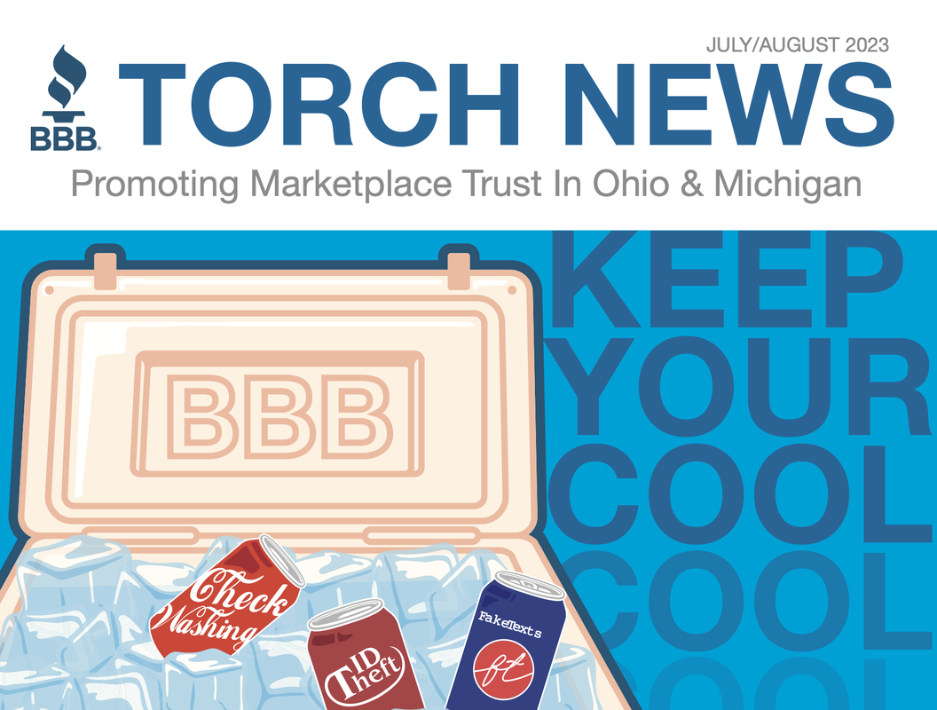
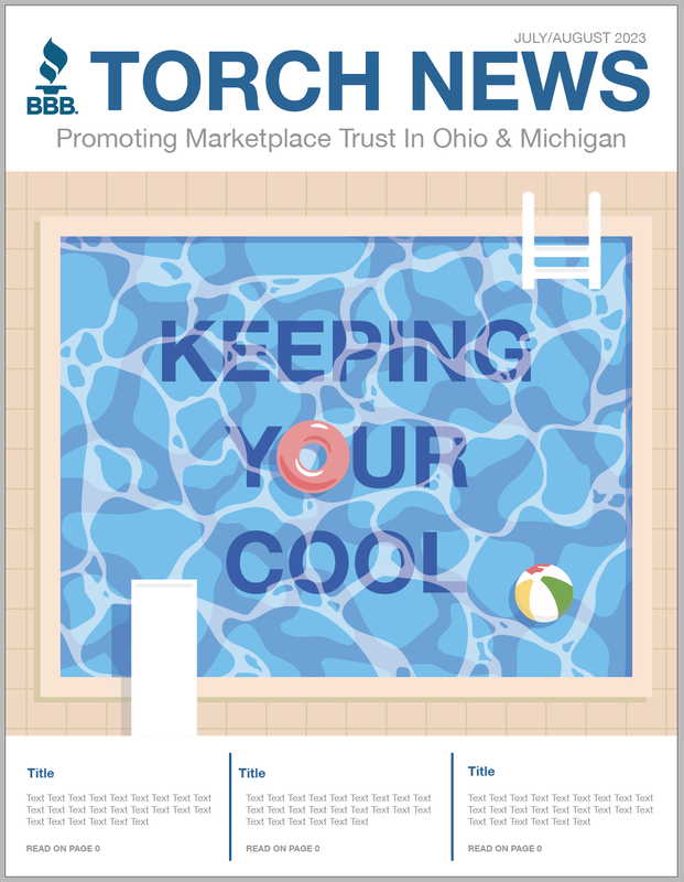
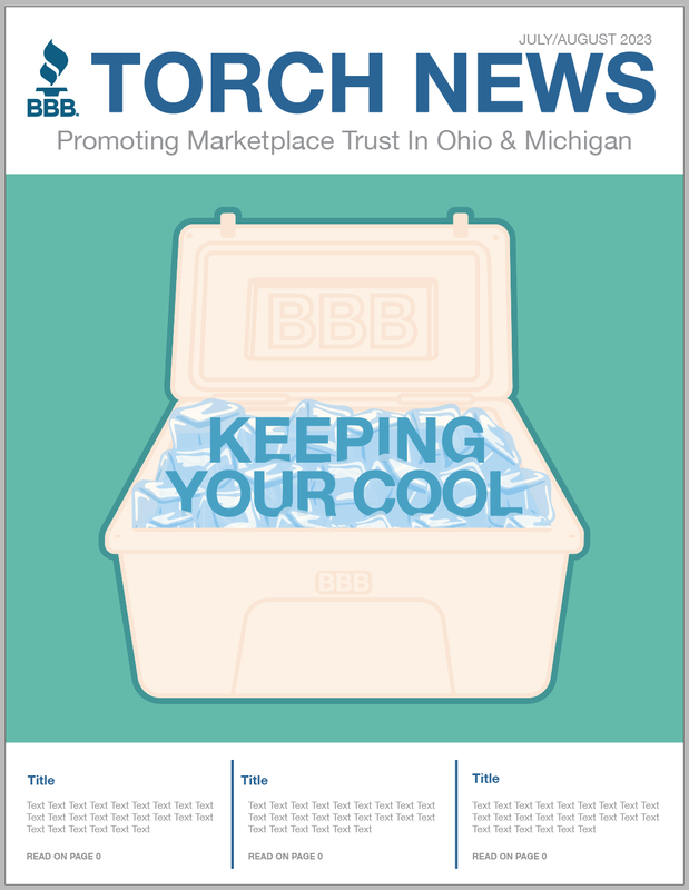
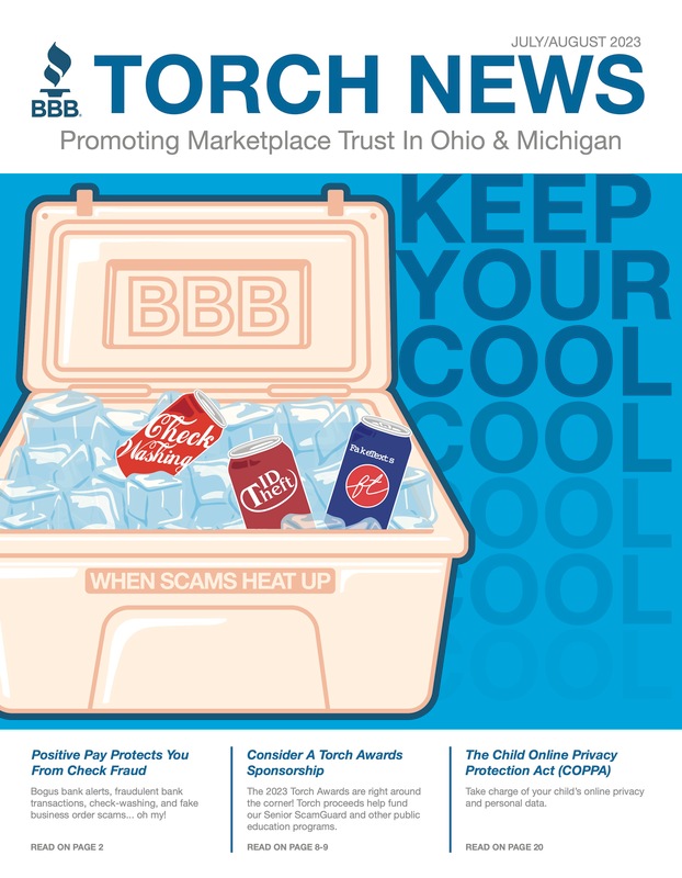
July - August 2023 Newsletter Cover
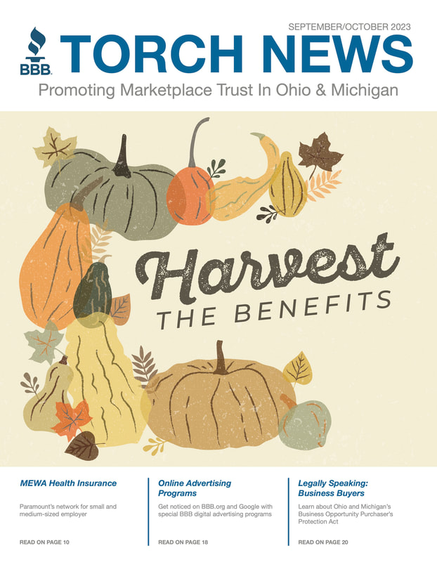
September - October 2023 Newsletter Cover
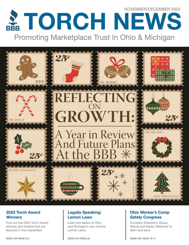
November - December 2023 Newsletter Cover
Final deliverables
the process
final versions & deliverables
deliverables
the process
final deliverables
process
final versions
the process
final versions & deliverables
  deliverables
the process
final version & deliverables
DEliverables 
The Process   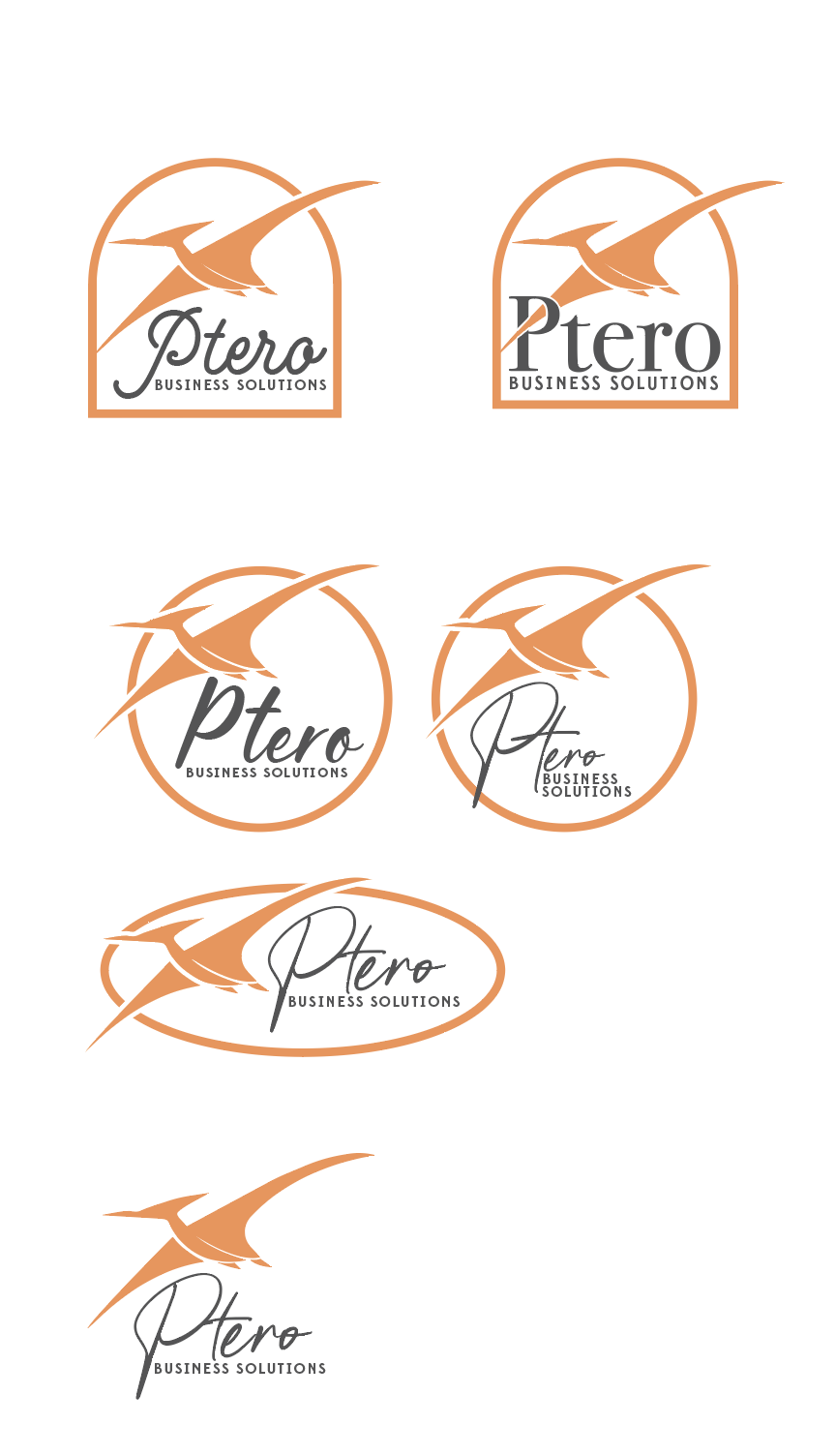 Final Deliverable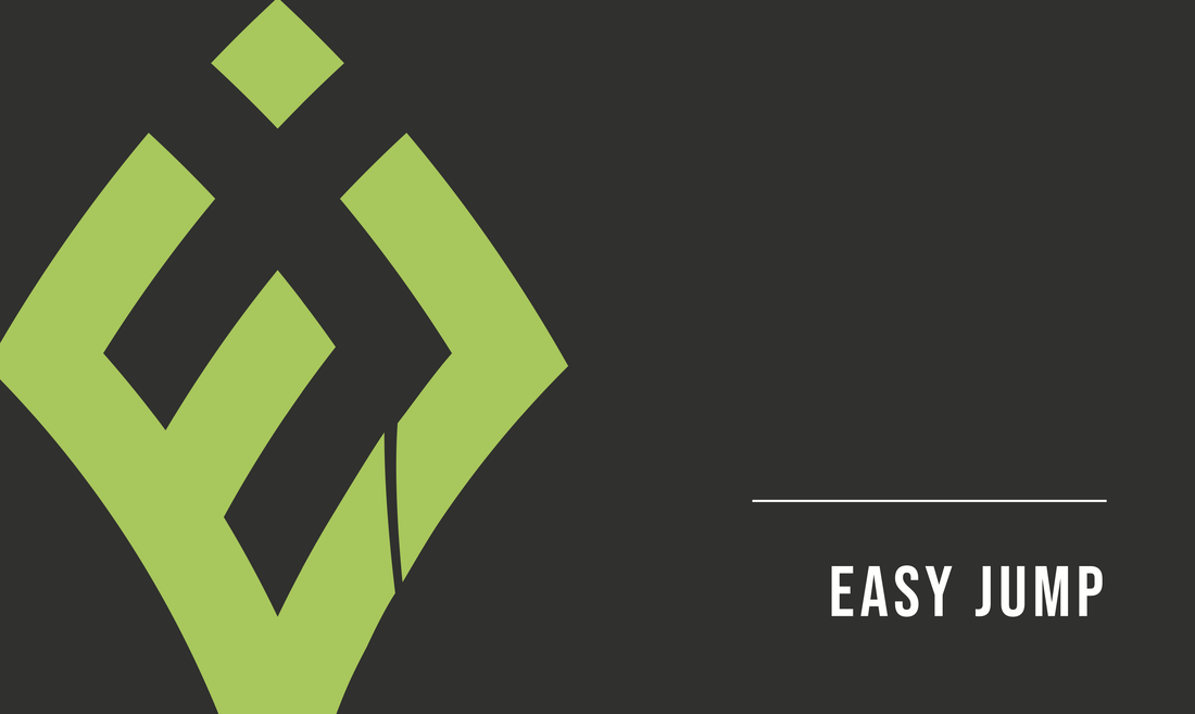
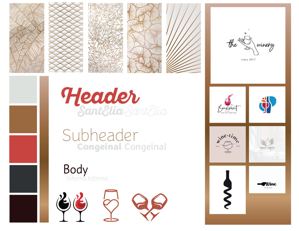
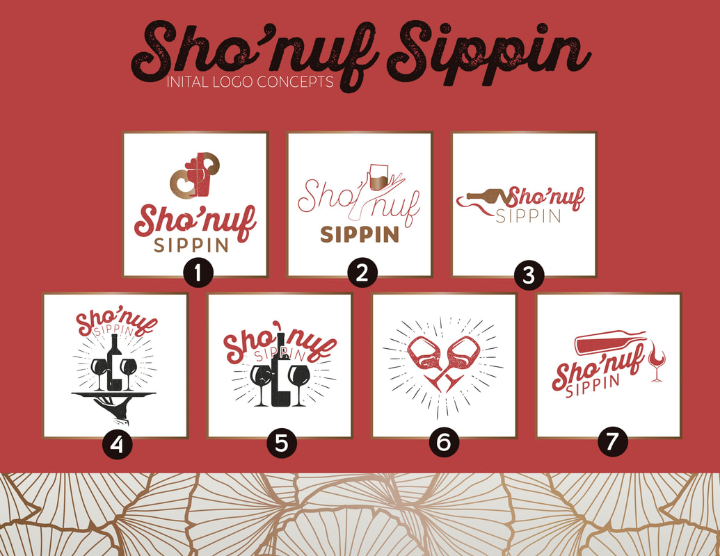
Objectives:
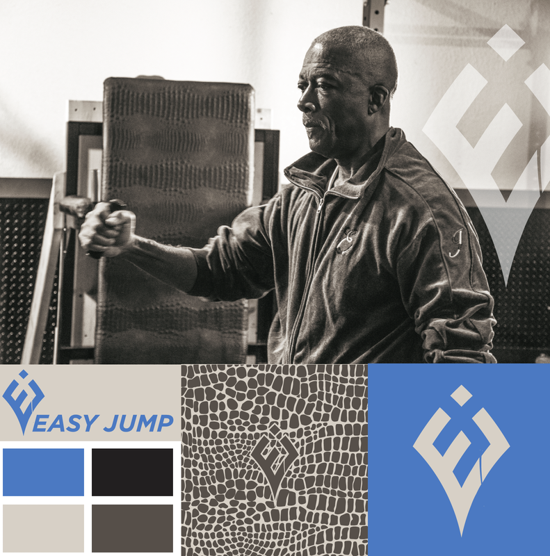
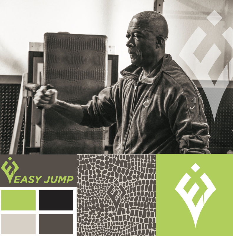
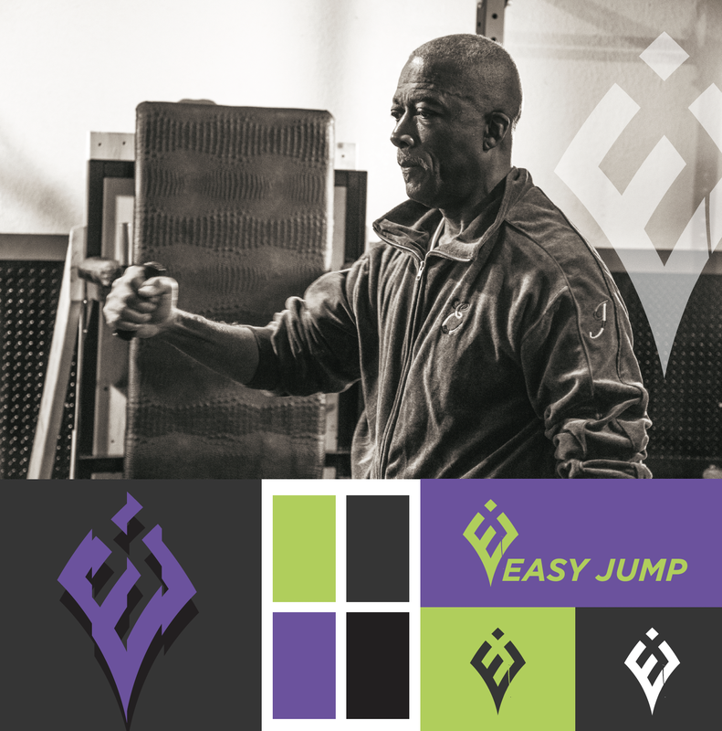
Brand Personality: The brand should reflect qualities such as innovation, reliability, approachability, and inclusivity. The tone should be empowering, motivating, and friendly, mirroring Eddie Jones’s vision of making fitness accessible to everyone. Visual and Design Elements:
Key Messages:
Expected Outcomes:
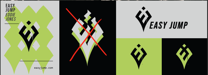
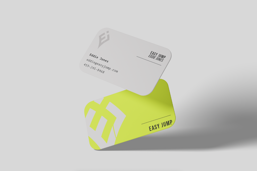
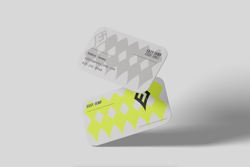
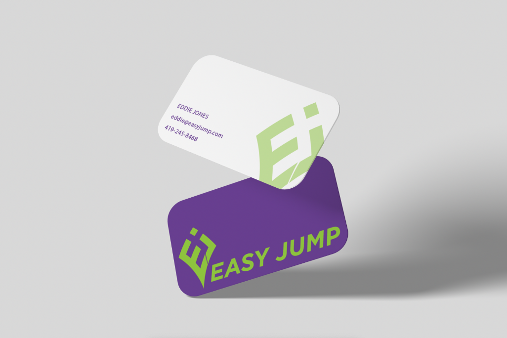
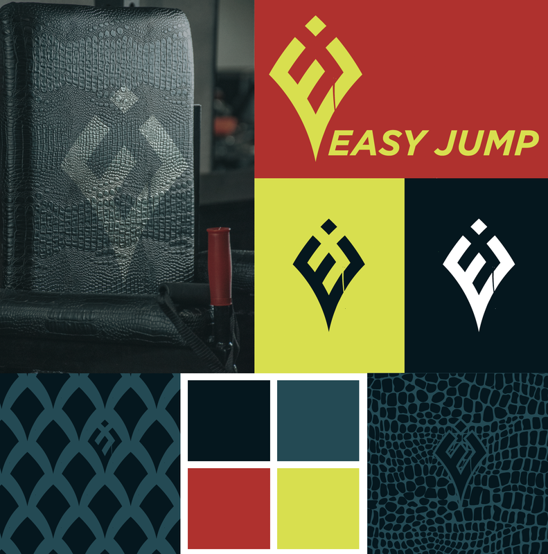
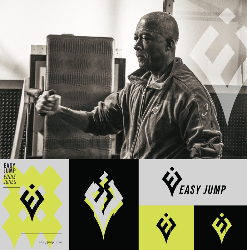
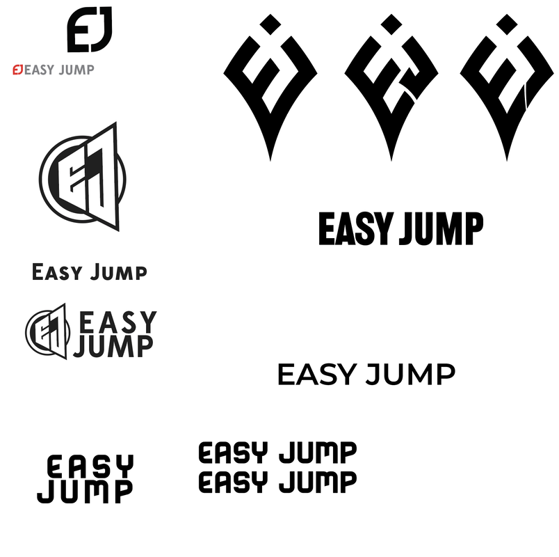
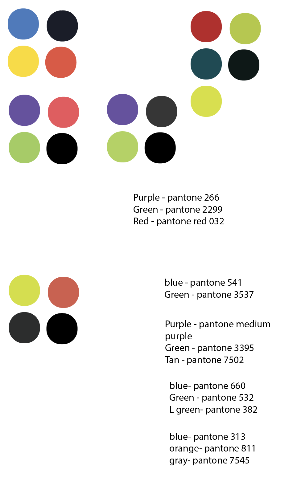
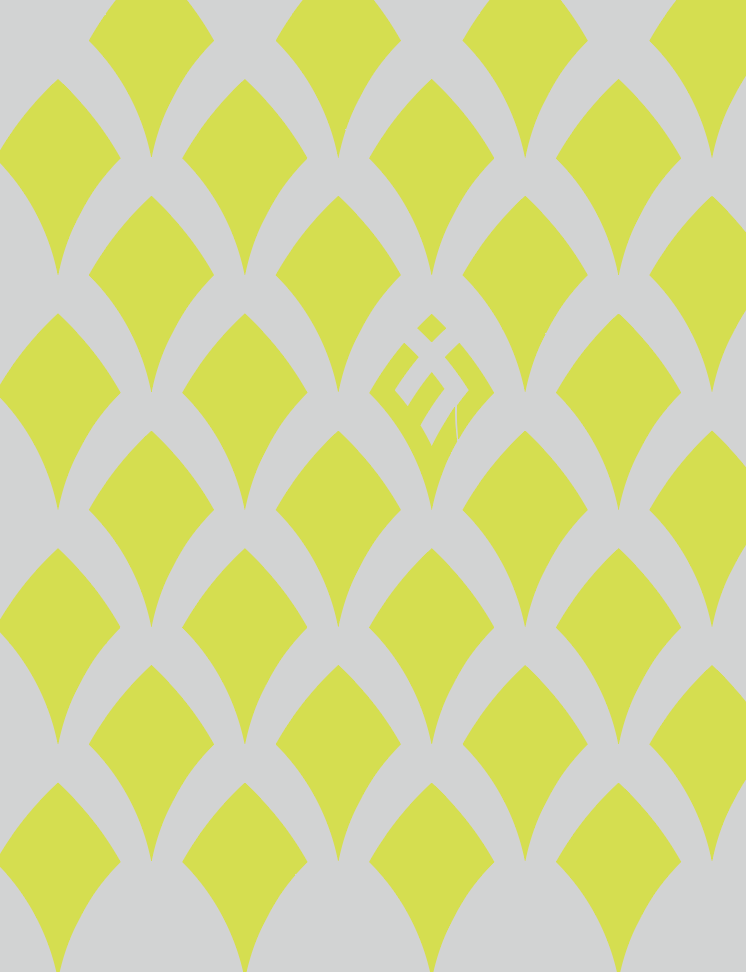
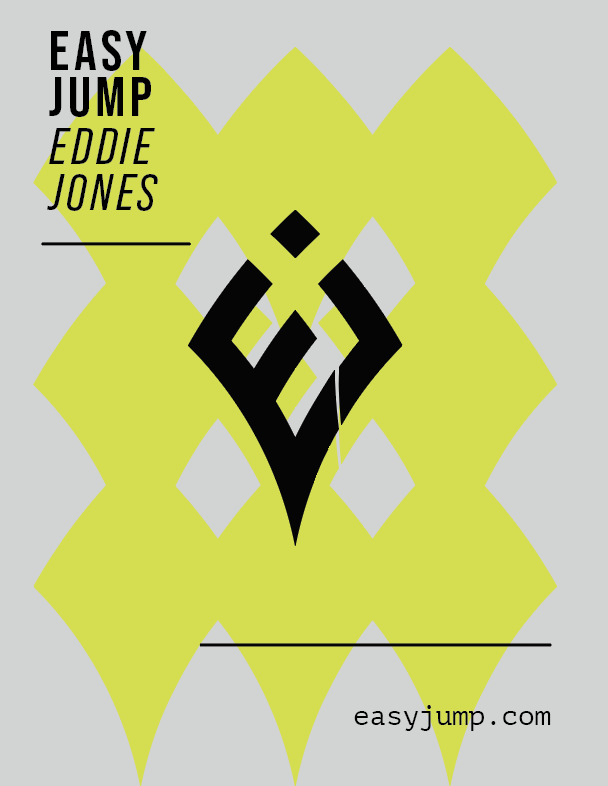
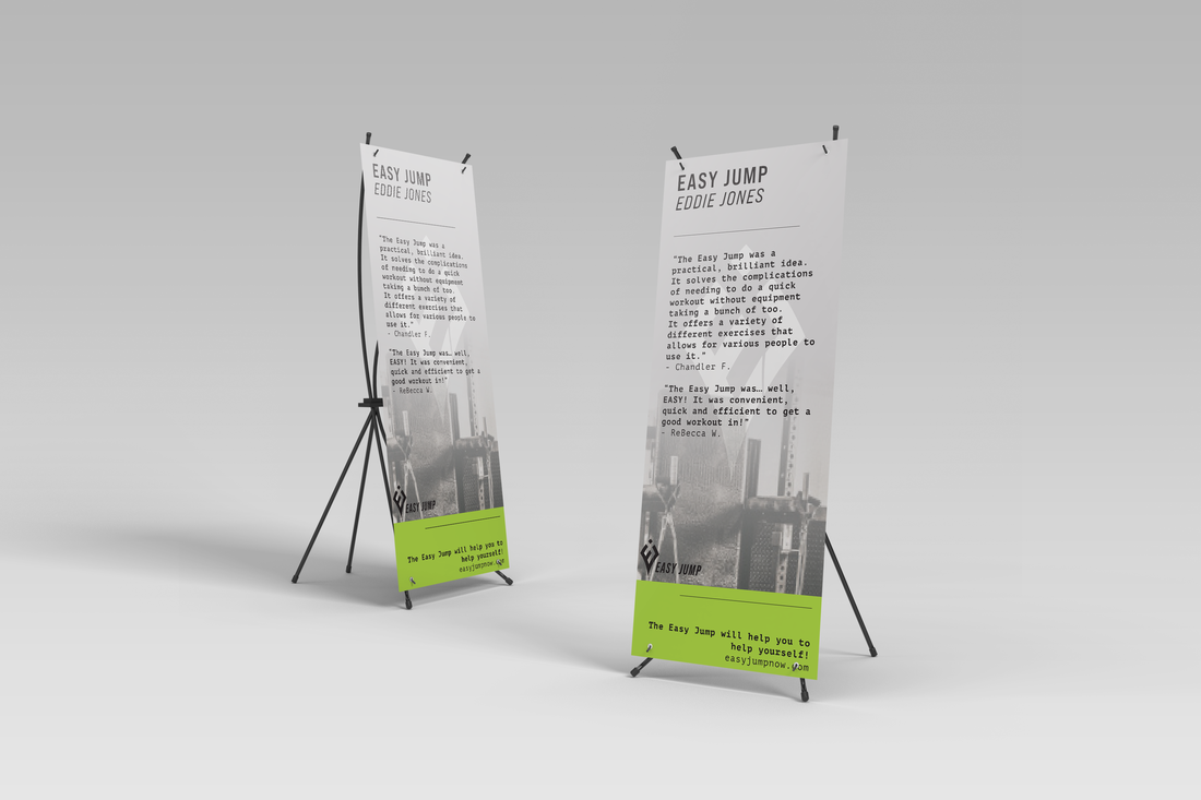
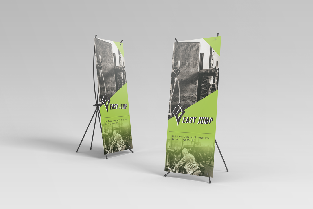
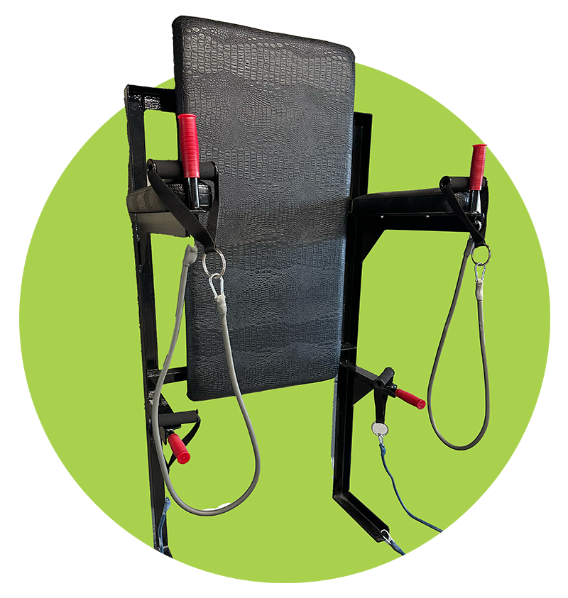
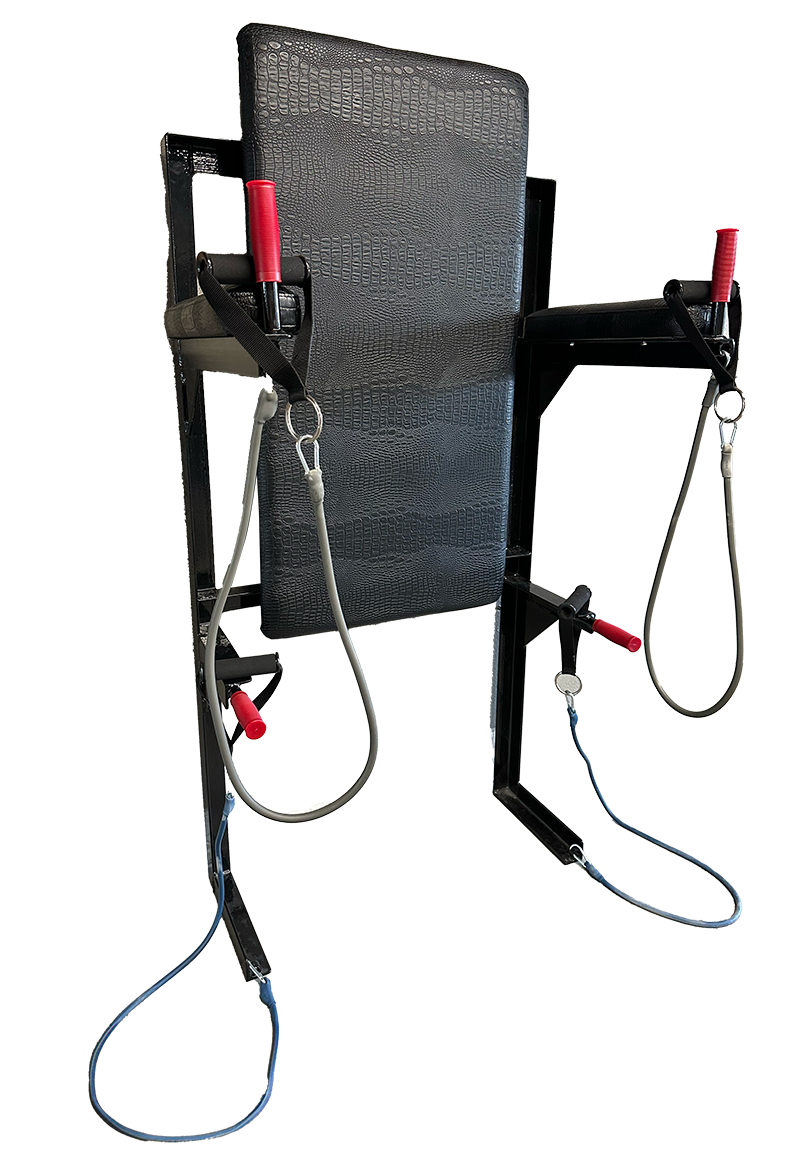
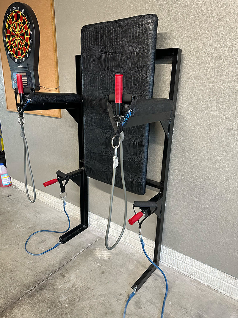
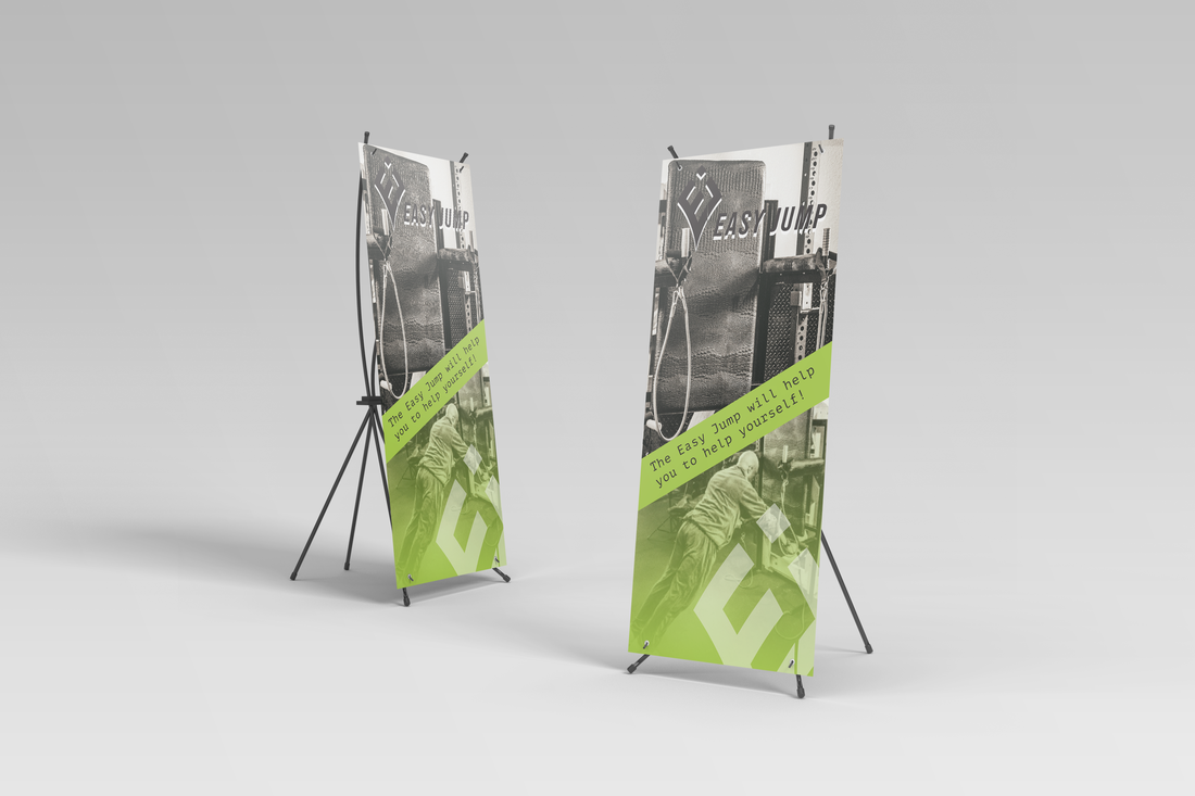
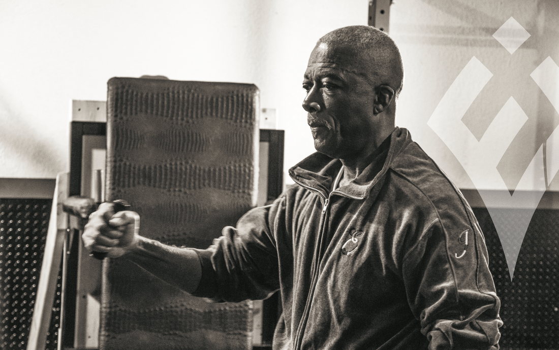
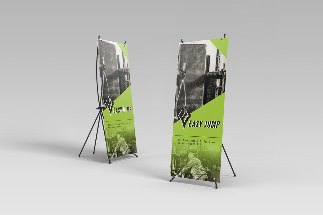
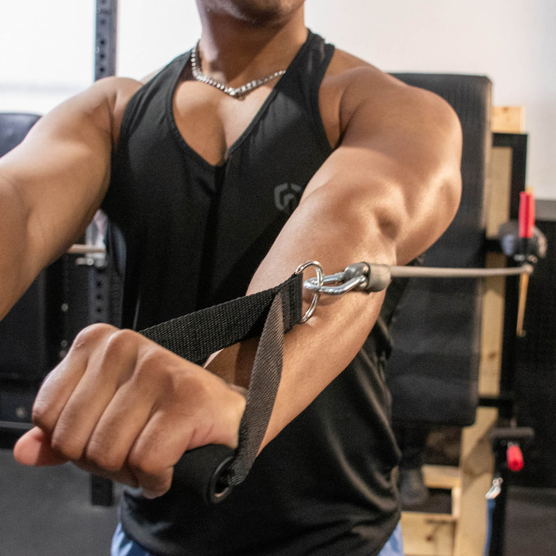
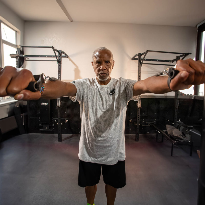
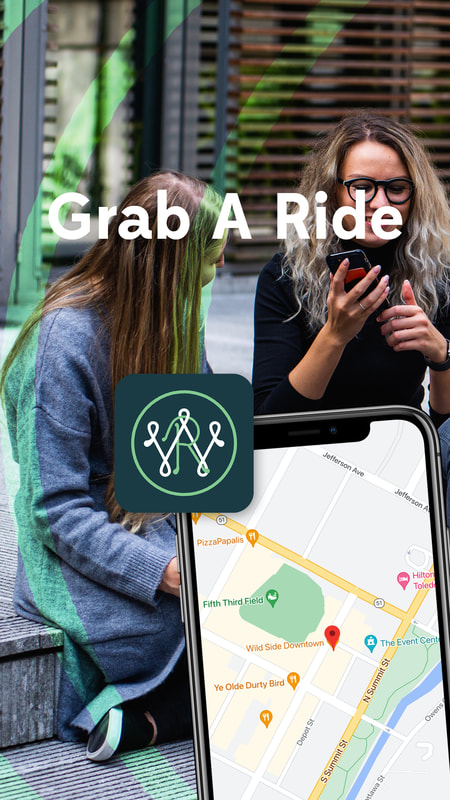
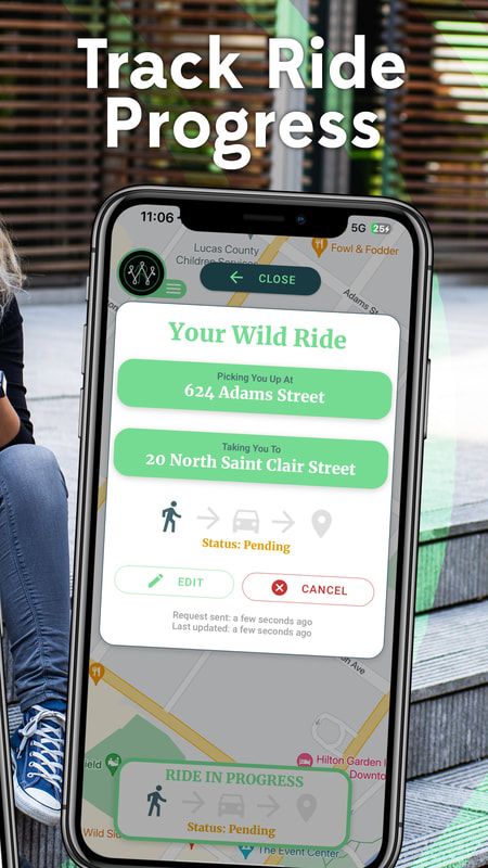
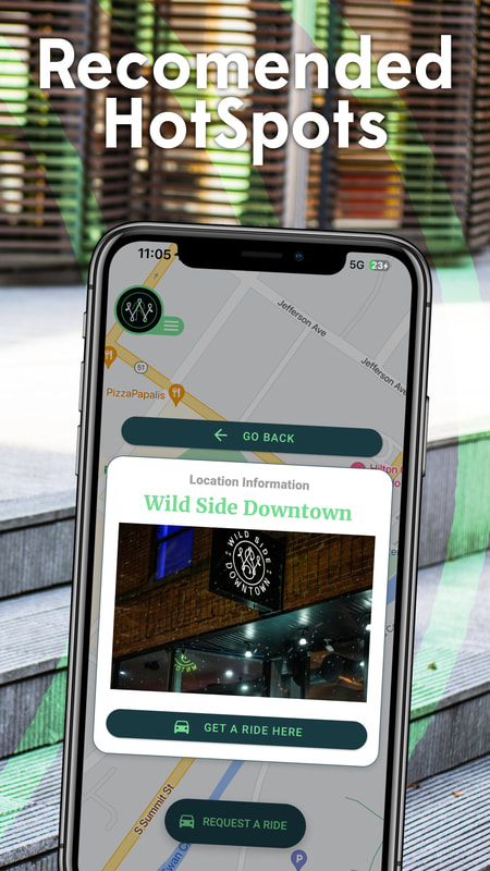
The ProcessEddie Jones’s partnered with Ape Forge to transform the Easy Jump System from an invention into a powerful and recognized brand. Final Versions & Deliverables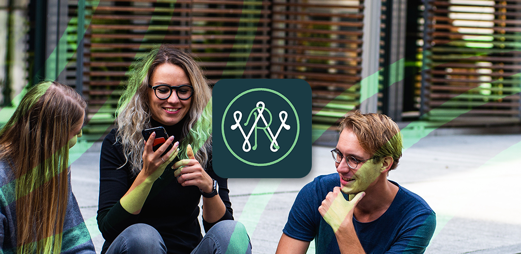 Wild Ride is an app designed to make it easy and convenient to get around Toledo, Ohio. With Wild Ride, users can call for a ride with a electric car from any location in the city. Simply open the app, select your destination and a nearby electric car will be dispatched to pick you up. Plus, Wild Ride allows special pickups from Wild Side Downtown - just select the "Pickup from Wild Side" option to get started. Wild Ride takes the hassle out of getting around and provides an eco-friendly ride with zero emissions. Give it a try and experience the convenience of Wild Ride today! Ape Forge was approached by Wild Side Brewery - Downtown to create an app and accompanying marketing materials to help promote their business, as well as design and develop an accompanying website. After taking on the task, Ape Forge efficiently created the desired app, marketing collateral, and website to ultimately help Wild Side Brewery - Downtown reach a broader audience and increase engagement. You can download this app for iOS and Android devices, along with the web app version. Visit www.wildride.app to learn more. |


|

© Ape Forge LLC 2024 | All Rights Reserved
|