Western Tile came to Ape Forge looking for a refreshed identity that matched the quality and reliability of their flooring services. As a licensed and insured business providing both materials and labor for residential and commercial properties, Western Tile needed a professional visual presence that would convey trust, craftsmanship, and a modern edge. Our team delivered a complete brand solution—starting with a custom logo and finishing with a new, responsive website.
The Creative Process:
Crafting the Logo
Discovery & Direction
Before we ever opened our design tools, we started with a deep dive into the Western Tile brand. We met with the client to understand their business, target audience, and long-term goals. Through those conversations, it became clear that their brand needed to reflect:
We explored competitor logos and gathered visual references to see what resonated in their market—and more importantly, what felt overused or stale. This phase helped us identify opportunities to differentiate their brand.
Before we ever opened our design tools, we started with a deep dive into the Western Tile brand. We met with the client to understand their business, target audience, and long-term goals. Through those conversations, it became clear that their brand needed to reflect:
- Professionalism: They’re seasoned contractors, not weekend warriors.
- Durability: Their work is built to last, and so should their branding.
- Regional identity: The name “Western Tile” evokes a sense of place, and we wanted to honor that.
We explored competitor logos and gathered visual references to see what resonated in their market—and more importantly, what felt overused or stale. This phase helped us identify opportunities to differentiate their brand.
Logo Concept Development
Our design direction began with the idea of grounding the brand in strength and simplicity. The challenge: create a visual identity that felt rugged and established, while still being clean and modern enough to work across digital and print mediums.
We explored three main directions:
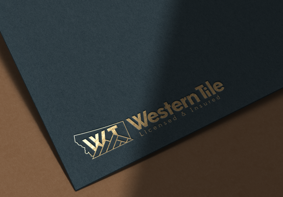
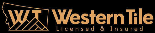
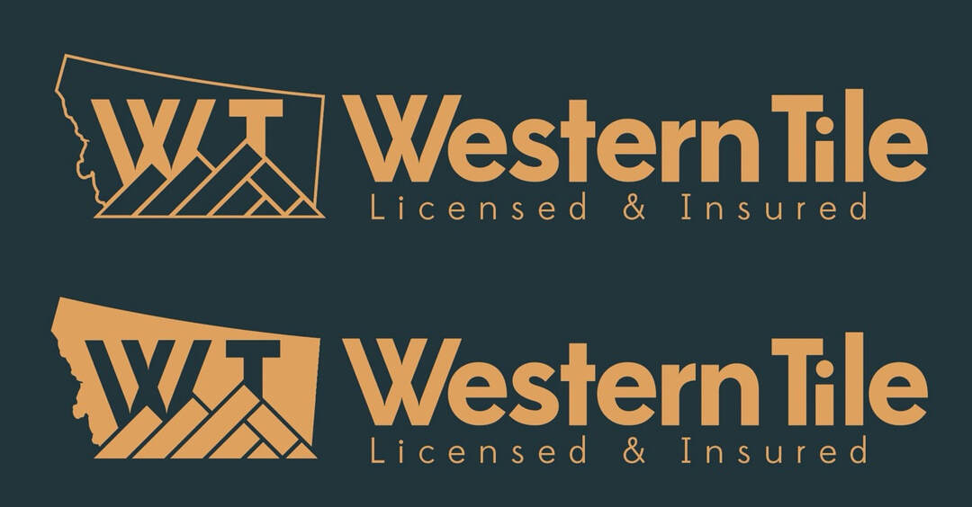
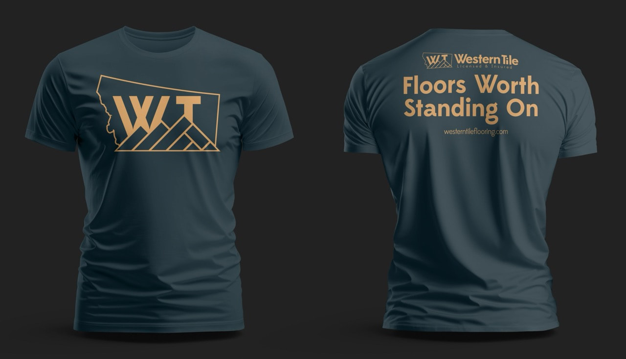
The final logo evolved from a hybrid of the first two: a stylized “W” with tile-like symmetry, constructed to look solid and grounded. The shape subtly mirrors interlocking tile edges, reinforcing the craft and precision of the work Western Tile delivers.
Color Palette Selection
Color was a critical part of defining the Western Tile brand. We focused on a palette that would convey both trust and durability, without veering into overly corporate or sterile territory.
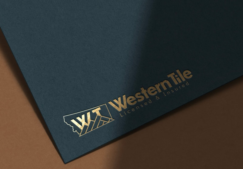
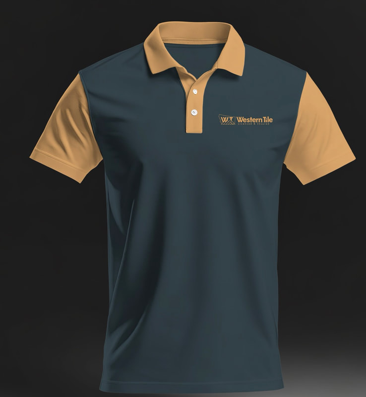
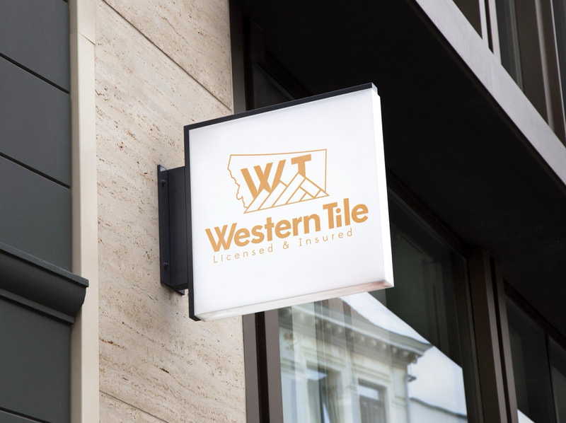
We tested the palette in different applications—business cards, vehicles, uniforms, and signage—to ensure legibility and consistency.
Our design direction began with the idea of grounding the brand in strength and simplicity. The challenge: create a visual identity that felt rugged and established, while still being clean and modern enough to work across digital and print mediums.
We explored three main directions:
- Geometric tile patterns – Representing precision and craft.
- Initial-based monograms – Bold, minimal, and timeless.
- Western-style motifs – Nods to the regional name without going full “cowboy.”
The final logo evolved from a hybrid of the first two: a stylized “W” with tile-like symmetry, constructed to look solid and grounded. The shape subtly mirrors interlocking tile edges, reinforcing the craft and precision of the work Western Tile delivers.
Color Palette Selection
Color was a critical part of defining the Western Tile brand. We focused on a palette that would convey both trust and durability, without veering into overly corporate or sterile territory.
- Primary color: Slate blue: Chosen for its association with strength, reliability, and professionalism.
- Accent color: Soft clay tan: A nod to natural materials and warmth, preventing the brand from feeling too cold or mechanical.
- Neutral tones: Charcoal and off-white: These create contrast and keep the brand grounded while offering flexibility across mediums.
We tested the palette in different applications—business cards, vehicles, uniforms, and signage—to ensure legibility and consistency.
Final Logo Attributes
Website Design & Integration
With the brand in place, we moved on to the website. The goal: to build a simple, elegant site that showcases Western Tile’s services while establishing trust with potential customers.
Features & Highlights:
- Icon + Wordmark Structure: The logo includes a distinct tile-inspired icon that can stand alone for branding assets like uniforms or social media avatars.
- Custom Typography: The wordmark uses a bold, industrial-style font with modified letterforms that echo the geometric structure of the icon.
- Responsive Design: Multiple lockups were created to ensure flexibility for both horizontal and stacked layouts.
Website Design & Integration
With the brand in place, we moved on to the website. The goal: to build a simple, elegant site that showcases Western Tile’s services while establishing trust with potential customers.
Features & Highlights:
- Custom-branded UI: Every page reflects the new logo and color palette, creating cohesion across the brand experience.
- Service-first structure: The homepage leads with credibility—highlighting their licensed/insured status, service areas, and core offerings.
- Mobile responsive: Built to look great on both phones and desktops, ensuring a smooth customer experience.
- SEO optimization: Structured content and targeted keywords were baked in from the start, helping the site rank locally.

Impact
Since launching the new brand and website, Western Tile has a visual identity that matches the quality of their work. The logo is clean, professional, and scalable. The website is converting visitors into leads, helping the business grow their presence in a competitive regional market. This project was a perfect example of how Ape Forge approaches design—from research and discovery, to design execution and digital rollout.